Digital marketing consultants view analytics data from many websites in various industries. It is rare that we don’t see at least 30% of all traffic coming from mobile devices, and usually it’s closer to 50%. Some Marketing Directors have realized the opportunity of improving conversion rates for half of their visitors with easy wins like customized mobile messaging. Others would be happy just having a site that looked good, and worked, on a mobile phone – no customized mobile conversion optimization strategy needed. Whatever your goals are for improving the mobile user’s experience on your site in 2015 and beyond, we hope this free mobile best practices guide helps ensure proper technical implementation of your strategy.
[section class=”wc-shortcodes-box wc-shortcodes-box-primary”]
TL;DR – Executive Summary
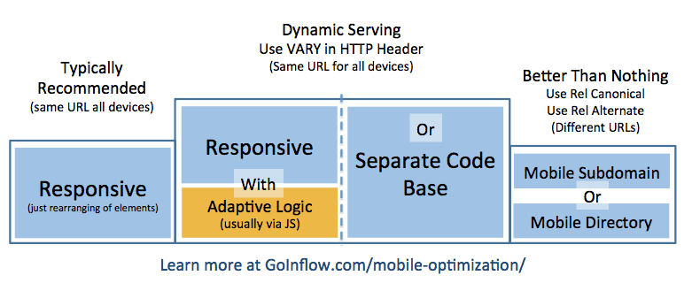
Inflow’s policy on mobile sites is illustrated with the image below, which is aligned with Google’s recommendations as of January 2015:
Most sites will be advised to use a simple responsive design (left). Although dynamically adjusting content (center two boxes) could potentially provide a better mobile user experience, implementation is much more difficult/expensive, and the Vary HTTP Header response can cause issues with content delivery networks (CDNs). Share this page with your development team to open dialogue and to ensure your mobile user strategy is implemented correctly from a technical standpoint.
[/section]
Rather Read This As A PDF?
Table of Contents (Skip To links)
Executive Summary
The best solution for most clients will be a responsive design that scales up and down gracefully for any device.
The downside to a responsive design site with a single code base is that mobile and desktop visitors don’t always want to see the same things, and the opportunity to specifically target one or the other is not being taken advantage of. This could keep the site from reaching optimal conversion rates for mobile visitors. The upside is that there is no need of either the Vary HTTP header response, or the Rel Alternate tag. There is also only one code-base.
In order to adjust messaging, calls-to-action and design features based on device type, clients can dynamically serve different HTML and/or CSS without changing the URL. This is what we are referring to as “dynamic serving.” The Vary HTTP header response must be in place for this option in order to avoid the slight risk of being penalized for “cloaking,” and so all caches of the page will use the correct (i.e. desktop) version.
When serving different HTML/CSS based on the user agent there are two options:
- Use the existing responsive layout code base and “adapt” page elements (messaging, CTAs…) for mobile, typically with JavaScript.
- Keep a separate code base for the mobile site so they are essentially two different websites that get served from the same URL.
- The downside is additional upkeep for the second code base.
- The upside is greater freedom to customize the mobile user experience.
Aside from doing nothing or requiring an App download, the least preferable solution is to put the content on a different URL. However, many businesses find this is their only option due to technology and budgeting issues. As long as “rel alternate” and “rel canonical” tags are properly implemented, having a separate mobile site can be a valid option.
Some automated SaaS and Plugin solutions are also discussed near the end of the guide.
Each Mobile Site Option in Detail
Although the options below are prioritized, each situation will offer reasons to weigh the various pros and cons. In the sections below, each viable option is discussed in detail.
Option 1 – Responsive Website Design
This is what we are going to recommend, if at all possible, in most situations.
Even when “selectively serving” content based on device type, it’s typically better to use the same HTML/CSS code base and dynamically serve the adapted content using JavaScript, as opposed to keeping a separate code base. All that is to say, you should start with a responsive website design in most circumstances.
So, What is Responsive Design?
In a nutshell, it’s having a single page/URL that adjusts itself to the size of the user’s screen using a single HTML code base, but dynamically rendering according to the CSS rules set up for that screen size. Here are some examples of CSS coding (using media queries) to adjust the page styles by common devices (e.g. Smart Phones, Tablets).
Here’s how Google puts it:
“Responsive web design is a technique to build web pages that alters how they look using CSS3 media queries. That is, there is one HTML code for the page regardless of the device accessing it, but its presentation changes using CSS media queries to specify which CSS rules apply for the browser displaying the page.”
“Using responsive web design has multiple advantages, including:
It keeps your desktop and mobile content on a single URL, which is easier for your users to interact with, share, and link to and for Google’s algorithms to assign the indexing properties to your content.”“Google can discover your content more efficiently as we wouldn’t need to crawl a page with the different Googlebot user agents to retrieve and index all the content.” (Source)
Is it Difficult to Implement (i.e. Expensive)?
The short answer is: it depends.
Popular content management systems like WordPress will often support a variety of easy-to-implement responsive themes. Some sites may require significant changes/additions to the CSS file and minor layout changes. Other sites may require a complete redevelopment.
What are the Pros and Cons of Responsive Design?
Responsive design offers several powerful benefits over some of the other options, and the few drawbacks can be mitigated with the use of JavaScript to customize the user’s experience without changing the URL or code base.
The Pros:
- Easier for your users to interact with your site from any device
- They will always be copying and pasting or “sharing” the same URL
- Their bookmarks work equally well on each of their devices
- One URL makes it easier for Google’s link algorithms to apply PageRank accordingly
- It provides better crawl efficiency so Google can crawl more of your site more often
- Developers only have to update one code base when changes are made to the site
- Unlike with other options, such as Adaptive Design/Selective Serving (next section), a simple responsive site does not need to change code based on user agents, and therefore is not prone to mistakes made with the Vary HTTP header, including CDN issues and perceived cloaking (discussed later).
The Cons:
- Compared to the other two options, responsive sites offer less ability to customize the messaging and experience for mobile users. It is essentially a desktop site that can be viewed easily on a mobile device, as opposed to a site that is specifically developed with mobile users in mind.
- However, even when dynamically serving mobile-specific content (as in the “selective serving” model discussed below), it is helpful to start from the base of having a responsive design so this issue can be addressed in the future with less effort.
- Compared to a completely separate mobile site/section (as in Option 3 below) responsive sites offer less ability to customize which resources get loaded and what gets rendered. This results in slower page loads, especially when the user is not connected to Wi-Fi.
Does this mean the only way to succeed in mobile SEO is to go the responsive route?
Absolutely not. Google says they do also support the dynamic serving method with either the same URL or a different URL. But if you do go those routes, Google is asking for some help in understanding the dynamic device specific HTML, which will be discussed in the following two sections.
Links to learn more about Responsive Design
- Responsive Web Design Basics – Google Developers
- Setting the Viewport Meta Tag – Google Developers
- Using CSS Media Queries for Responsiveness – Google Developers
- Mobile-Friendly Test – Google Developers
- Designing for Breakpoints – A List Apart
- HTML Responsive Design Guide – W3Schools.com
- 12 Premium Responsive Landing Page Templates – Mashable
- Responsive WordPress Themes – Theme Forest
Option 2 – Dynamic Serving
A lot of terminology gets thrown around in different ways when speaking about this topic. For our purposes, “responsive” and “adaptive” design are to be thought of as separate-but-similar things that are not mutually exclusive. You can have adaptive features without a responsive design, or you can add adaptive features on top of a responsive design to dynamically add, remove or change page elements by user agent.
When it comes to your creative content (i.e. Content Marketing) it may help to start from the perspective of a mobile user and adapt that to desktop, rather than the other way around. Dr. Pete from Moz wrote about Google’s internal shift to a “mobile first” policy here.
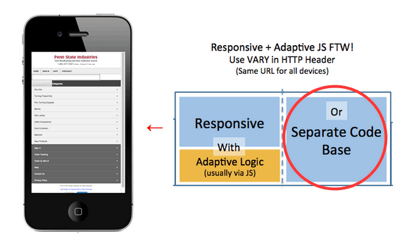
There are two primary ways of adapting the content and experience specifically for mobile users (as opposed to making one responsive page without changing the content) that do not require changing the URL. Penn State Industries (PSI), an eCommerce site on Miva Merchant, offers a unique example because they actually do both (1/1/2015).
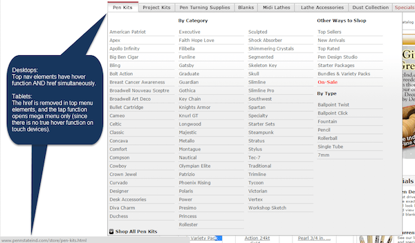
PSI has a completely separate mobile version of the site on the same URL. However, they are also adapting the desktop page for tablet users. When someone navigates the site with a mouse on a desktop, they can hover over the top-level category to see the fly-out navigation of subcategories and related links. Clicking the top level category link (e.g. Pen Kits) from a desktop or laptop takes you to that category page. Tablet users don’t drag their fingers around the screen like a mouse, but rather “tap” the menu they want. Therefore, the link had to be removed from the main category page label so tablet users could tap it and see the full menu.
The image below illustrates an “adaptive” feature without responsive design…
However, most mobile—and some tablet—users are going to see the mobile version of the PSI site, which looks completely different, although it appears on the same URL:
Combining Adaptive and Responsive FTW?
Orkin.com is a great example of how adaptive features can be applied to a responsive site. It scales responsively for desktops, tablets and mobile phones, which allows them to serve content from the same URL and code base. The full desktop site displays close-up images of common pests (below). However, notice how on tablets and mobile devices (or if you reduce the size of your desktop window) the images of all of the pests have been removed in order to show more of them on a single screen (above/left).
Essentially, the moment you get beyond simply reordering and resizing page elements, and move into the realm of changing the content and messaging for mobile users, you have begun to bring adaptive features into your responsive design. Our in-house conversion rate experts agree that this is the best way to go if your business really wants to maximize conversions from mobile devices without keeping a separate mobile website. However, it is not without its risks and drawbacks, as will be explained in detail later.

The Vary HTTP Header
You must use the Vary HTTP header when dynamically adjusting the content for different users. It is not necessary for simple responsive design, but becomes necessary the moment content gets added, removed or changed by user-agent, cookie or referrer.
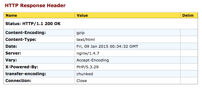
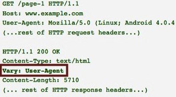
The Vary HTTP header has two important uses:
- It signals to caching servers to consider the user-agent when deciding whether to serve the page from cache or not. Without the Vary HTTP header, a cache may mistakenly serve mobile users the cache of the desktop HTML page, or vice versa.
- It helps Googlebot discover your mobile-optimized content faster, as a valid Vary HTTP header is one of the signals they may use to crawl URLs that serve mobile-optimized content.
The Vary HTTP header is not a meta tag. The Vary response is located in the HTTP header (like 301 redirects), not in the HTML header (like rel canonical tags).
SEOBook has a good HTTP header checker tool that will allow you to see the header response of any URL. It’s best to check with two, so I usually run it through Web-Sniffer, too.
Option 2.1 – Responsive Code Base with Adaptive Logic Via JavaScript
Websites that are not yet responsive should be advised to go responsive first. Those that are already responsive may consider dynamically adjusting mobile users’ experiences with JavaScript or some other method to detect the user agent and adjust accordingly. However, it is not without risks and should only be done by companies who have the wherewithal to address them.
Is it Difficult to Implement (i.e. Expensive)?
The short answer is: yes.
Any time a site dynamically adjusts content by user agent the difficulty, expense and risks increase dramatically. That said, there is little difference between this and what many sites are already doing for conversion optimization testing.
What are the Pros and Cons of Dynamically Altering a Responsive Code Base?
Up until now, it may seem that this is the way to go. However, some very serious issues arise when dealing with content delivery networks while using the Vary HTTP header. This is why we will typically recommend a simple responsive site for most clients.
The Pros:
- If things go awry, it’s easy enough to pull out the JavaScript and Vary response in order to default back to a simple responsive design.
The Cons:
- It’s easy to goof up user agent detection, as Google explains here. The dangers of getting this wrong include:
- A poor user experience for someone being served the wrong content
- A Google penalty for perceived cloaking
- When a content delivery network (CDN) sees a Vary response in the HTTP header, they may choose not to serve the cached version of the page, which essentially renders the CDN useless. You can’t just turn off the CDN on enterprise sites, so how do you get around this? Here are some options:
- Give it Up. Don’t dynamically serve content. Instead, choose one of the other options discussed in this document.
- Take a Risk. Skipping the Vary header altogether carries a slight risk of being perceived as cloaking, but the main drawback of not including the “user-agent” attribute in the Vary header is just the lost opportunity of not sending all possible mobile ranking signals Google, and possibly showing the wrong cached version to a user.
- Scale it Down. Vary headers are controlled by the server, and are sent with each element of the page that is requested. Therefore, you could forgo the Vary response on the HTML page, but add it to the HTTP header for external resources (e.g. Images, CSS, Videos, JavaScripts). As Cindy Krum reports, this “is only a good idea if there are a very low number of elements that must come directly from your server—and you should still test to see the impact before site-wide deployment.”
- Call your CDN representative. See if they have a work-around. Someone from Akamai has written in a Google Group that, but Cindy Krum wrote on SEL that she wasn’t having much luck with it.
Option 2.2 – Separate Code Base (e.g. PennStateInd.com mobile site)
This is similar to having a completely separate mobile site, with the notable exception that both are served from the same URLs.
Is it Difficult to Implement (i.e. Expensive)?
The short answer is: yes.
You are essentially operating two websites here, in addition to dealing with several tricky technical issues.
What are the Pros & Cons of Dynamically Switching the Code by User Agent?
This solution has all of the difficulties presented by dynamically altering content from the same HTML/CSS code base, with the added difficulty of maintaining two separate sites.
The Pros:
- Maximum ability to customize the mobile user experience without sending them to a different URL.
- This is a good solution for businesses with experienced in-house developers and a strong budget who want to maximize conversions from mobile traffic, while maintaining a consistent buyer’s journey from the same URL.
The Cons:
- See the cons from Option 2.1 above (Responsive Code Base with Adaptive Logic).
- Requires maintaining of two separate code-bases (websites).
Links to learn more about Dynamic Serving
Dynamic Serving Configuration – Google Developers
Mobile Site Configuration & The Vary HTTP Header – Search Engine Land
How Google’s Mobile Best Practices Can Slow Your Site Down – Search Engine Watch
CDN Caching Problems – The “Vary: User-Agent” Header – ./orcaman
Option 3 – Separate Mobile Site URL

Technically, there are at least three ways to have a mobile site on separate URLs: A mobile directory, mobile subdomain or a separate top-level domain (TLD). Until someone gives us a good reason not to, we’ll assume having a mobile site on a completely different domain (i.e. separate TLD) is not a viable option, which leaves us with the two discussed below:
- Mobile Subdomain (mobile.domain.com)
- Mobile Directory (domain.com/mobile/)
Required Meta Tags—Annotations Recommended by Google
With both options, it is important to annotate the relationship between matching desktop and mobile pages/URLs with rel=”alternate” and rel=”canonical” tags.
Rel Alternate Usage—Goes on Desktop Page
Add a rel=”alternate” tag in the HTML header of the desktop page, which alerts search engines to the corresponding mobile URL and helps define the relationship between the two pages.
Rel Canonical Usage—Goes on Mobile Page
Add a rel=”canonical” tag in the HTML header of the mobile page, using the URL of the corresponding desktop URL. This alerts search engines to the corresponding desktop URL, and helps define the desktop URL as the canonical version to be shown in the search engine results, and to inherit any ranking signals (like external links to the page) from the mobile page.
Should you also put a self-referencing rel=”canonical” tag on the desktop page?
This is not necessary, but does not hurt either.
Should you also put a rel=”alternate” tag pointing to the desktop page (and/or other alternatives) from the mobile page?
This is not necessary. Look at it this way: One is the “alternative” version and the other is the mainstream “canonical” version. You can have multiple alternatives, but there is only one canonical. The canonical lists all of the alternatives, and each alternative only needs to list the one canonical.
Pitfall to Avoid: Listing non-alternate URLs as alternates
When using rel=”alternate” and rel=”canonical” markup, maintain a 1-to-1 ratio between the mobile page and the corresponding desktop page. In particular, avoid annotating many desktop pages referring to a single mobile page (or vice versa). If you don’t have a complete mobile site (e.g. desktop site has 20 pages and mobile site only has 5), it’s best to only use the rel=”alternate” annotation on desktop pages that have a corresponding mobile page. Leave the rest of them alone, as they do not technically have a mobile “alternative.”
Automatic Redirects to the Mobile Page
In terms of SEO, it’s fine to automatically redirect a visitor to the appropriate page based on their device. As for usability, it’s important to allow redirected visitors to access the desktop version if they wish (make the button easy to see).
JavaScript is an acceptable means of redirecting here, but client-side redirects (e.g. those that occur after the page/HTML begins downloading) can slow down the process of getting a visitor to the correct page.
In many cases, a server-side HTTP redirect is advised. Google says to use a 302 (i.e. a “temporary” as opposed to a “permanent 301” redirect). But wait, won’t that mean the two pages won’t share ranking signals like external backlinks because it isn’t a 301? Normally yes, but in this case, the bidirectional relationship annotated via the rel=”canonical” and rel=”alternate” tags supposedly does the trick. Essentially, Google treats a rel=”canonical” tag to a different page as a 301 permanent redirect for the purposes of consolidating ranking signals and choosing which to show in the SERPs. Use your best judgement. Personally, I’ll be continuing to recommend 301s until convinced otherwise. But here’s what Google says:
“For this purpose, it does not matter if the server redirects with an HTTP 301 or a 302 status code, but use of 302 is recommended whenever possible.”

Important Tool: Pure Oxygen Lab’s Mobile Redirect Viewer
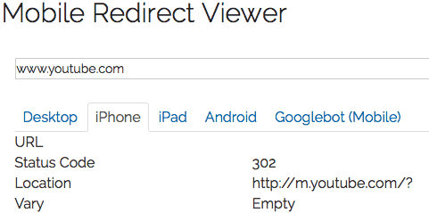
This free tool by a great mobile optimization company allows you to easily see the different HTTP header responses served to different types of visitors.
In the screenshot to the left, we can see that TechCrunch is “302 redirecting” iPhone users, and the HTTP header response indicates that the content (and redirect behavior) varies based on cookies.
In the screenshot below, we see that Google is not taking their own advice with the YouTube domain, which “301 redirects” mobile users to the m.youtube.com subdomain, but does not indicate this with the Vary response. Take this with a grain of salt; Google typically has a “do as we say, not as we do” approach to everything.
Pitfall to Avoid: Catch-All Redirects to Mobile Site
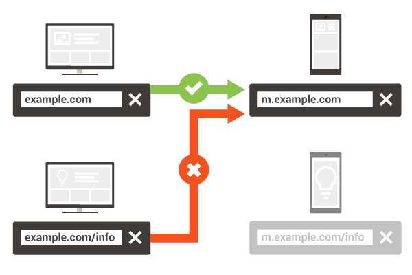
Don’t redirect multiple desktop URLs to a different mobile page. As with bi-directional annotation, maintain a 1-to-1 ratio between the mobile page and the corresponding desktop page. This is a best practice for reasons pertaining to SEO, but is equally important for user experience, such as when someone on a mobile device is trying to access a page that only exists on the desktop site. Being automatically redirected to a different page without the content you’re looking for is frustrating.

Do You Need the Vary HTTP Header?
No. Even though you are detecting the user-agent for the redirects, you do not need to use the Vary User-Agent response header in this case.
Rel Alternate Annotation/Markup in the XML Sitemap
Google supports including the rel=”alternate” annotation for the desktop pages in Sitemaps. The XML Sitemap code would look something like this:
<?xml version="1.0" encoding="UTF-8"?>
<urlset xmlns="https://www.sitemaps.org/schemas/sitemap/0.9" xmlns:xhtml="https://www.w3.org/1999/xhtml">
<url>
<loc>https://www.example.com/page-1/</loc>
<xhtml:link rel="alternate" media="only screen and (max-width: 640px)" href="https://m.example.com/page-1" />
</url>
</urlset>
Important Note: The rel=”canonical” tag in the HTML header on the mobile page is still required, and should point to the URL of the desktop page (source).
Option 3.1 – Mobile Subdomain (https://m.domain.com)
Out of the two, this is typically our preferred option for reasons outlined in the pros and cons below. Most notably perhaps, is the relative ease at which different technological solutions, such as separate content management systems, can be implemented with this setup.
Annotation Example
The following tag would appear in the HTML header of the desktop page:
<link rel="alternate" media="only screen and (max-width: 640px)" href="https://mobile.example.com/page-1" >The following tag would appear in the HTML header of the mobile page:
<link rel="canonical" href="https://www.example.com/page-1" >Pros of a Mobile Subdomain:
- Unlike separate TLDs, subdomains may inherit some of the Domain Authority from the parent domain, though not as much as a subfolder.
- Each subdomain has its own Analytics and Webmaster Tools account for easier segmentation of data (also a con).
- Though there are ways to point a specific directory to a different server than the rest of the site, this is much more easily done with a subdomain setup, allowing webmasters to have both a blog CMS like WordPress and an eCommerce platform like DemandWare.
- It becomes much easier to completely customize the mobile user’s experience. In fact, an entirely different team could be in charge of this site as long as they adhere by basic branding standards.
- Related to the above point, it opens a whole new world of conversion optimization for sites that have hit the plateau in “continuous improvement” of conversion rates.
Cons of a Mobile Subdomain:
- It complicates everything from analytics to email to security certificates and, of course, SEO by adding another URL, particularly another “domain,” into the mix.
- Separate Analytics and Webmaster Tools tracking in many cases.
- Two code-bases to maintain.
Option 3.2 – Mobile Directory (domain.com/mobile/)
This option will not be recommended unless there are very good reasons to do so for a specific situation. If the client is already using this solution, we should be checking to ensure it is set up properly (i.e. rel alternate and rel canonical tags, as well as redirects) while consulting to determine if a responsive design with dynamic serving of certain page elements could be a better solution for them.
Annotation Example
The following tag would appear in the HTML header of the desktop page:
<link rel="alternate" media="only screen and (max-width: 640px)" href="https://www.example.com/mobile/page-1" >The following tag would appear in the HTML header of the mobile page:
<link rel="canonical" href="https://www.example.com/page-1" >Pros of a Mobile Directory:
- Unlike separate TLDs and subdomains, a mobile directory would inherit more Domain Authority from the parent domain, though it is almost a moot point with the use of rel canonical, rel alternate and redirects.
- A single Analytics and Webmaster Tools account allows for easier setup and maintenance (but less ability to segmentation of data compared with a subdomain).
- Compared to a single code-base, it is easier to completely customize the mobile user’s experience.
Cons of a Mobile Directory:
- Pointing a specific directory to a different server than the rest of the site can be difficult to set up, requiring the use of reverse proxies, or iframes, or changes in the httpd.conf or .htaccess file.
- It may be more difficult/expensive to build and maintain compared to a subdirectory.
- Two code-bases to maintain.
- It is not generally recommended by search engines.
- It is not something most visitors will be used to.
More Options
Below are some resources that may be of use when choosing the best option for clients. Included here are some plugin-in and SaaS solutions that could serve as stop-gap measures while a full responsive/dynamic serving site is being developed.
Developing a Mobile App
Native mobile apps continue to be the primary way users interact on mobile, and how many businesses handle mobile users. However, apps are not typically a good stand-alone solution for many businesses because they require visitors to download something in order to have a good user experience on a mobile device. They can be great ways to provide additional value, and to engage visitors further if you already have a mobile-optimized website. Some types of businesses will have their main presence be within an app, but the majority of non-tech-startup businesses out there need to realize that statistics about how much time people spend in mobile apps Vs the web should be taken with a grain of salt considering most of that time is probably spent on a few select games (Angry Birds, Candy Crush, Trivia Crack…) the big social apps (Facebook, FB Messenger, Snapchat, Instagram…). Aside from perhaps Amazon and eBay, eCommerce businesses are better off fixing their website than building an app if they have to choose between the two.
Below are some resources on developing mobile apps.
- Is a Mobile App Right for Your Business?
- Responsive vs. Mobile Site vs. Mobile App
- 10 Platforms for Mobile App Development
- BuildFire Builds Apps for You Too
- COMO Apps for Any Business
- Taplytics Analytics & A:B Testing for Android & iOS Apps
- Appsbar Easy DIY App Builder
- Make an App Easy as Pie with AppyPie
- Small Business Mobile Apps Made Easy
- MobileRoadie App Creator
Expect to pay anywhere between $25,000 to $100,000 for high-quality mobile app development outside of a “free” mobile app development tool, which usually end up costing hundreds per month if your app gets much use.
Automated (Instant) Mobile Sites
Sometimes clients will not have the budget to use one of the recommended methods above. They may also be on a common platform like WordPress, which could make the entire process much easier. Below are a few solutions to consider for this type of smaller client.
We have not tested all of the solutions below. Instead of evaluating each of them (which is often difficult to do because they don’t show you how it all works on their websites), we will instead inform clients to [wc_highlight color=”blue”]ask the following questions:[/wc_highlight]
- Does the mobile site go on my domain or yours? If the mobile site goes on the vendor’s domain, it’s a non-starter. Walk away.
- Does the mobile site have a rel=”canonical” tag that points to the desktop version of each page? If not, walk away. They may tell you it’s not necessary because the site is non-indexable, but this isn’t the solution you want. The mobile site should be indexable, but should canonicalize to the desktop version.
Duda Mobile offers a free version in which your site appears in mobile form on their domain (e.g. mobile.dudamobile.com/site/yoursite). We recommend going with the Premium version instead, which puts the site on your own subdomain (e.g. m.yoursite.com). The pro here is that it’s quick and easy. The cons are that you’ll be locked into a $7.20 – $9 monthly contract, and are limited to what their platform does, which isn’t “optimized” for your specific visitors.
bMobilized claims to give you a mobile-optimized version of any site instantly. I could not find info on the two vital questions above.
WordPress
Although there are plenty of instant mobile site plugins for WordPress, including WPTouch and WordPress plugins from some of the services above (e.g. Duda), they usually require a monthly fee to access premium features. Because there are so many responsive WordPress themes out there from which to choose, we recommend re-theming/redesigning as opposed to using a plugin. Below are some responsive WP theme resources.
When choosing a responsive theme, be aware that the free version of some of these will require you to link back to a developer website, sometimes even unrelated sites (like their clients) from the footer. Tips: Choose carefully, be wary of “free” themes and never agree to link to other sites from anywhere on your site in exchange for a free theme, as this violates Google’s webmaster guidelines
The Default WordPress Responsive Theme – This is a highly customizable foundation from which to start your own responsive WordPress design. It is highly rated, well tested, free and comes straight from WordPress. It’s also quite simple looking out of the box.
Responsive WP Themes from StudioPress – These are premium themes, but are very affordable.
Responsive Themes on ThemeForest – These are premium themes, but are very affordable.
30 Free, Stunning Responsive WordPress Themes – Some of these look great, but beware of footer links.
Responsive Themes from Elegant Themes – These are premium themes, but are very affordable.
Other Resources
The list of resources below includes some that were referenced within this document, as well as any link that may be of use when developing a mobile site strategy.
Resources From Google
Perhaps the best source on the web for information about how to create and optimize a mobile-friendly website comes straight from Google. Several of these links have also been mentioned in the above sections.
Google’s Mobile Friendly Site Tester
If this tool says the site is mobile friendly, it should get the “mobile friendly” designation in the SERPs.
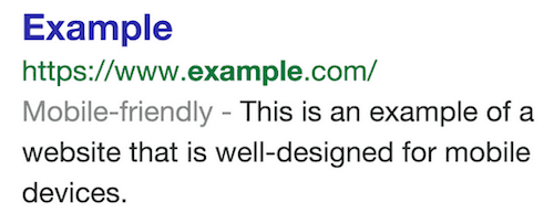
Below are some of the things Google’s testing tool looks for when evaluating whether or not a site is mobile friendly:
- Avoids software that is not common on mobile devices, like Flash.
- Uses text that is readable without zooming.
- Sizes content to the screen so users don’t have to scroll horizontally or zoom.
- Places links far enough apart so that the correct one can be easily tapped.
If you want to make sure that your page meets the mobile-friendly criteria:
- Check your pages with the Mobile-Friendly Test.
- Read our updated documentation on our Webmasters Mobile Guide on how to create and improve your mobile site.
- See the Mobile usability report in Google Webmaster Tools, which highlights major mobile usability issues across your entire site, not just one page.
- Check our how-to guide for third-party software like WordPress or Joomla, in order to migrate your website hosted on a CMS (Content Management System) to use a mobile-friendly template.
Learn more on the Google Webmaster Central Blog.
Even More Google Resources…
- Google’s Mobile Site Development Home Page – The best place to start your research.
- Mobile Site Configurations – This may seem familiar to you now
- Why You Should Have a Mobile-Friendly Site
- How to Get Started on a Mobile-Friendly Site
- Top Three Things to Know When Building a Mobile Site
- Common Mistakes to Avoid When Developing for Mobile
- Common Mistake #1: Blocking Resources – Google says: don’t block CSS, JavaScript or other resources needed to fully render the page.
- Using the Viewport Meta Tag to control layout on mobile browsers
- The New Multi-Screen World – Google PDF from 2012 (still relevant)
- The Mobile SEO Guide – Advanced Web Ranking blog
Non-Google Resources
Besides Google, there are many other fantastic resources on mobile site design, development and optimization. Some are listed below:
- Internet Retailer’s Mobile eCommerce Portal – by
- Education Resources from the MMA – Mobile Marketing Association
- Mobile Optimization Terminology and FAQ – by Pure Oxygen Labs
- Mobile Redirect Viewer – by Pure Oxygen Labs
- Google’s Text Version Of Mobile-Friendly Web Pages In Search Result by Barry Schwartz
- The New Mobile SEO Strategy by Ben Goodsell on Search Engine Watch
- Official: Google Recommends Responsive Design for Mobile by Barry Schwartz
- HTTP Header Definitions (e.g. Vary and User-Agent) on W3.org
- What is the Function of the Vary: Accept HTTP Header on Stack Overflow
- Mobile Optimization Best Practices on Moz
- Why Mobile Matters – Now (RE: Google’s “mobile first” policy) by Dr. Pete on Moz
- How to Easily Analyze Competitors’ Mobile SEO Performance by Aleyda Solis on State of Digital




I appreciate your research and advice. These are excellent tools for bloggers as well as social media marketers. Email qualifier, Flipboard and StumbleBar are other suggestions from my end. It was an interesting reading. Take care, All the best.
Great Blog Thank You
Oh my goodness! Amazing article dude! Thanks, However I am having problems with your RSS. I don’t understand the reason why I cannot subscribe to it. Is there anybody else getting identical RSS problems? Anybody who knows the solution will you kindly respond? Thanks!!
Hi Jaime,
Thanks so much for your comment!
To answer your question, our RSS feed is located at: https://feeds.feedburner.com/inflow.
Feedburner gives you a handful of options to subscribe with a variety of clients.
Please let us know if you continue to have issues with this.