Most business owners have lots of expertise when it comes to customer acquisition. Your business plan may already focus on these elements: your target audience, any opportunities in the space, and an idea of how to expand. You’ve gone through a lot of work to curate your products, or maybe even produce these products yourself. You’ve taken the time to identify your ideal customers and done everything you can to get them (and only them) to your site. Maybe you’ve even optimized your site to make sure users actually find the products they are looking for.
Where many businesses fall short is securing that last piece — getting a user who has, against all odds, actually found their ideal product, to take the next step and buy. Here are 5 common Product Detail Page (PDP) problems that prevent users from converting, along with some tips for how to solve them to make sure you capitalize on the opportunities you’ve worked so hard to create.
5. Poor product images

One of the biggest challenges for consumers purchasing online is making sure they have found a product that will suit their needs. Sometimes a model number will suffice, but only if the user has actually seen the exact product somewhere else. In most cases, however, users are viewing your product for the first time when they reach your site. In order to build confidence that they have found the right item, or to avoid product returns when the item does not meet expectations, be sure to have a great product display. This may include any number of things, from multiple angle shots to good product zoom to video of the product in action. The easiest way to do this is to put yourself in your users’ shoes and ask yourself this: “If I knew nothing about this product, would I be able to figure out what I need from these product images?” If the answer is no, you might need to upgrade your product display.
4. Poor mobile experience

Some websites have yet to see any impact from the recent influx of mobile users. Others see that these users tend to convert at a much lower rate. Whatever the reason, many sites are still ignoring their mobile experience. If you are, this is likely costing you more than you realize.
It is true that users have been slow to adopt mobile as a preferred device for transacting. However, a strong majority of users say they do conduct research on mobile before ultimately transacting on another device or in store. If users come to your site and have a poor experience, you are taken out of the running immediately. As Google sees that users are not getting what they need on this page, your share of traffic will also decline.
So how does this impact the overall conversion rates? Basically, you’re missing out on website visitors who are already done with research on mobile and ready to purchase. You might not see this clearly in your conversion rates since the users might never even reach the site on desktop. You might even take a hit in your conversion rates as more users start to come to the site across devices. But you will also see a corresponding increase in the ultimate goal: actual conversions.
3. Difficulty selecting product options

This one can be extremely frustrating to users. Imagine this: You’ve spent hours looking for exactly the right product, compared multiple sites to find the one that works best for you between pricing, customer support, and shipping options, and you finally are ready to pull the trigger. But when you start trying to select your product options — size, color, special instructions — you can’t do it. Make sure that if users need to select a size, they have a clear indication of what each size means (size chart, measurements for each size, etc.). If you offer truly custom colors, offer a tool that pulls up the colors from a well-known brand — for example, Sherwin Williams or Behr for paint colors — and validates the swatch you enter. On the flip side, if some options are not available, make sure to mark this clearly and let the user know what courses of action are available (can’t order, backorder, etc.).
2. Pricing and shipping concerns
When it comes down to it, all users are price sensitive. If they can get an item cheaper and faster from a competitor, then it is very unlikely they will choose your site. There are some cases, such as having a robust return policy like Nordstrom or Sephora, where users will pay for the higher level of service, but these are the exception, not the norm.

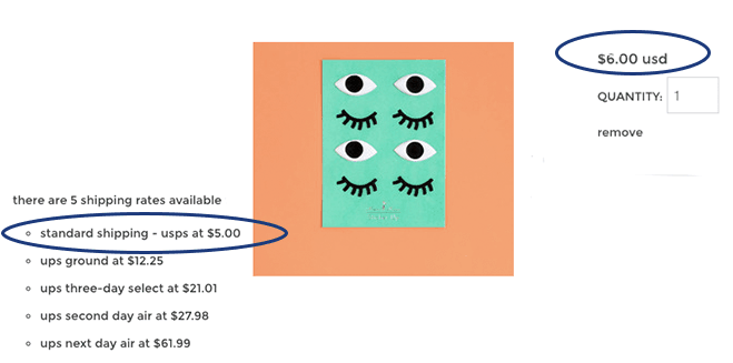
Make sure your prices are at least somewhat competitive. If all of your competition offers free shipping, you might want to consider this as well (and make sure it’s indicated on your product pages)! You may also want to consider the urgency factor — let users know how long it typically takes to ship items, particularly if you turn them around within a day. If you know shipping speed is a concern, let users know how long they have before the item gets delayed another day (a la Amazon — order in the next few hours to get it by Tuesday). Ultimately, the more you can do to assure the user the item will not cost them a ton and will get there when they want it, the better.
1. Unclear value proposition or calls to action
When users are viewing a product, there are two important things they will want to know: why do I want this, and how do I take the next step. If the answer to either of these questions is difficult to determine, you’re likely to lose your customers.
Somewhere on your PDP, preferably in a prominent place, you will want to include some detail about the strengths of this product. This is frequently a part of the product description, but it can also be handled by highlighting awards or acclaim from users. Showing the customer reviews and ratings can also be effective. Furthermore, users might already know the product they will buy, but are choosing a vendor. To address these users, having prominent information about the benefits of buying from you — great customer service, return policies, etc. — can help you win out over the competition.
When it comes time to take the next step, make sure the call to action is easy to find and that the most common or preferred action is the one with the most prominence. If the page is long, make sure to periodically add extra calls to action within the page, or to dock a call to action at the top or bottom of the page as the user scrolls to more detail. If the process is going to require some other interaction, such as a discussion with a rep over the phone, make sure users know they aren’t finished. Finally, make sure that the text of your calls to action is clear and matches the action that happens on-click; you don’t want users confused about what will happen when they take action.
Wrapping up
In the end, almost all of these items come down to clarity. Users want to be able to do research on any device on their own terms. Once they are ready to move forward, they want to do so with confidence that they know what will happen — how much it will cost in TOTAL, when it will get there, and what else they might have to do to complete the order. Getting these things right should give you a significant bump in performance and help you make the most of your efforts elsewhere.


0 Comments