As part of our continuing work tracking and compiling data about Best in Class eCommerce sites, today we’ll break down the features that make up best in class cart experiences; according to our conversion optimization best practices research.
Final Pricing Available
The user is able to obtain the final cost in the cart or at least an estimate
By the numbers:
| 7 | 12 |
From Walmart.ca:
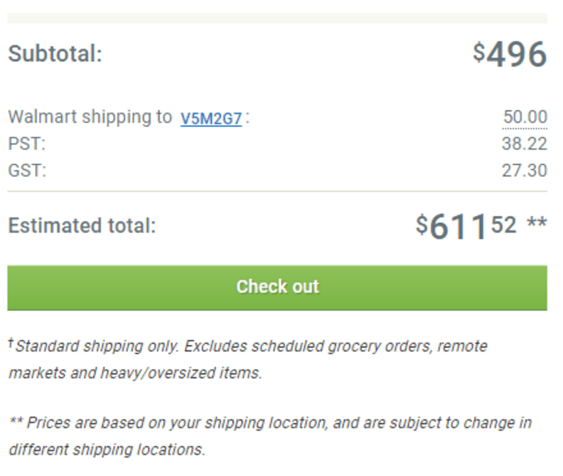
What we say:
This is ideal when possible, because users are looking for final pricing and they don’t want to have to get past their billing address in the Checkout to get it. Often business considerations prevent this, however, if you take a look at how the 7 eCommerce sites on our Best in Class list do it, you might see you could take the same approach.
Shipping and Handling Listed
Shipping costs listed in the cart/cart page
By the numbers:
| 11 | 7 |
From Sephora.com:
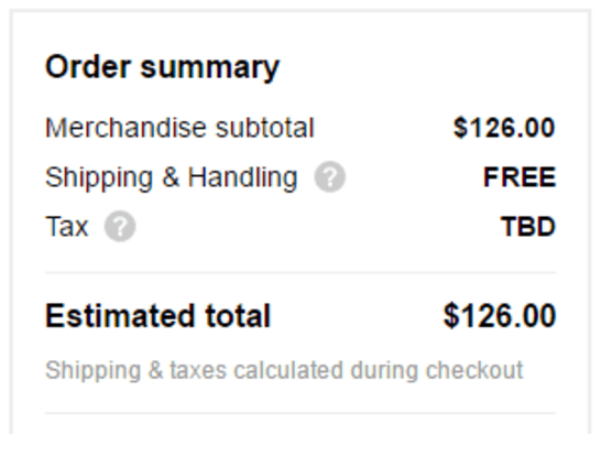
What we say:
Even if you can’t provide the final cost of the order (estimated or not), you might be able to provide the cost of shipping (and handling if that applies) in the cart. 11 out of 18 eCommerce sites on our list do this.
This works best with Free or Flat-rate shipping.
Returns Information
Is the return policy clearly stated on the cart page?
By the numbers:
| 10 | 9 |
From Sorel.com:
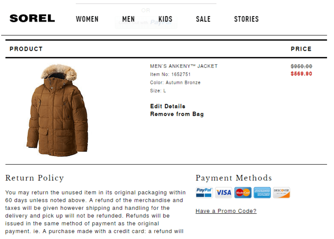
What we say:
If you expect people to pay a decent amount of money, then you can be sure a lot of them will want to know your Return Policy before buying. You can make it easy or lose sales – your choice.
If you have a strong return policy, like Nordstrom or Sephora, make this more prominent because it adds a lot of value. If not, the info should still be available, just not a focal point.
Customer Service Prominent
Does the site provide a very visible and simple customer support method?
By the numbers:
| 14 | 5 |
From RoomandBoard.com:
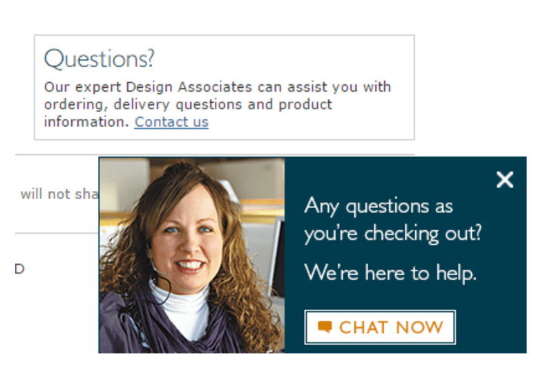
What we say:
This is a growing trend we highly recommend following – users frequently make decisions now based on things like service and trust, price is not the only factor.
Take a cue from RoomandBoard.com and pop-up your chat when the user scrolls to the bottom of the page (they’re already looking for something, so why not offer to help?)
Badge Assurances
Does the cart page display any secure shopping certificates? (Including customer service rating, identity theft, etc.)
By the numbers:
| 4 | 15 |


What we say:
Users on mobile are inherently a bit more distrustful, so we recommend using badges to assure users even if you’re not using the traditional badges. If you have a strong brand and a high level of trust in your industry, you can forego security seals if you really want to, like 15 of the 19 Best in Class eCommerce sites on our list. But if your company does not surpass Norton or McAfee in trust when it comes to your prospective customer, you should keep at least that.
Beyond security, are those badges that highlight customer services (i.e. BBB), highlight customer review rating (i.e. BizRate), or assure people around payment (i.e. PayPal).
Estimated Arrival or Ship Date
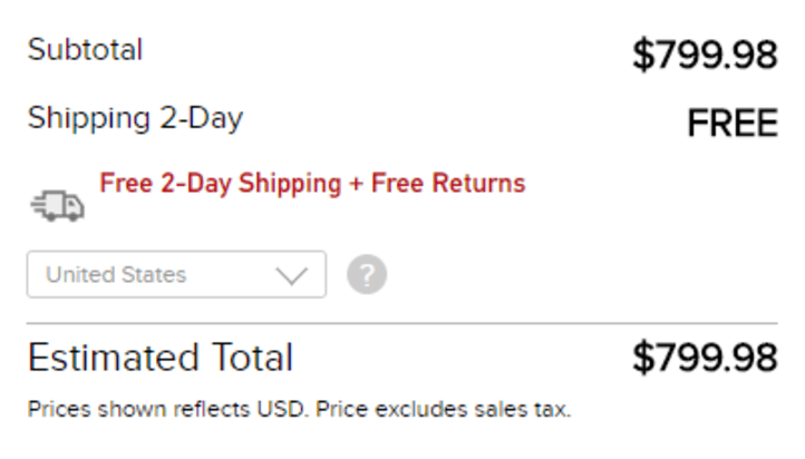
On the cart: Clear indication of when the user can expect the item to arrive, or at least when it will ship out.
By the numbers:
| 9 | 10 |
From GoPro.com:
What we say:
The trend here favors providing this info, but some sites are getting creative. Zappos offers free next-day shipping through their app, but doesn’t provide a shipping estimate on the desktop site.
If you are not Zappos, you might be best off providing people with “Free 5-Day Shipping” and call it a day until you can figure out how to offer “Free 2-Day Shipping” which is the “Gold Standard” (i.e. GoPro.com).
Repeat Main Value Proposition
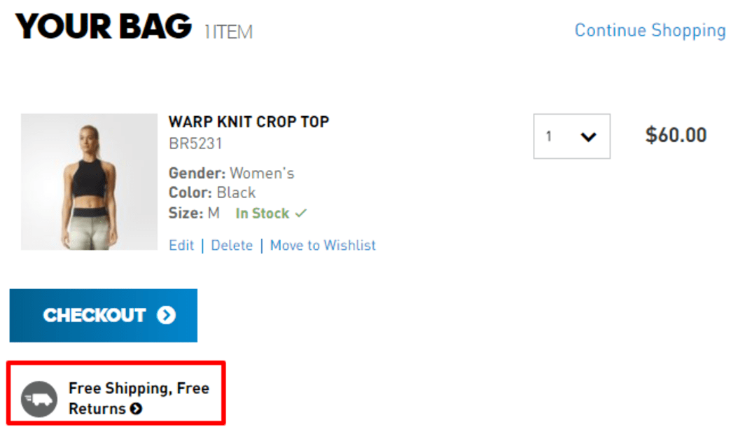
i.e. Free Shipping, Free Returns, Next Day Delivery
By the numbers:
| 11 | 9 |
From Adidas.com:
What we say:
If people are driven by Free Shipping on your site, then keep mentioning it in your cart. Every site has a primary value proposition, be sure to highlight yours.
Pay with PayPal in Cart
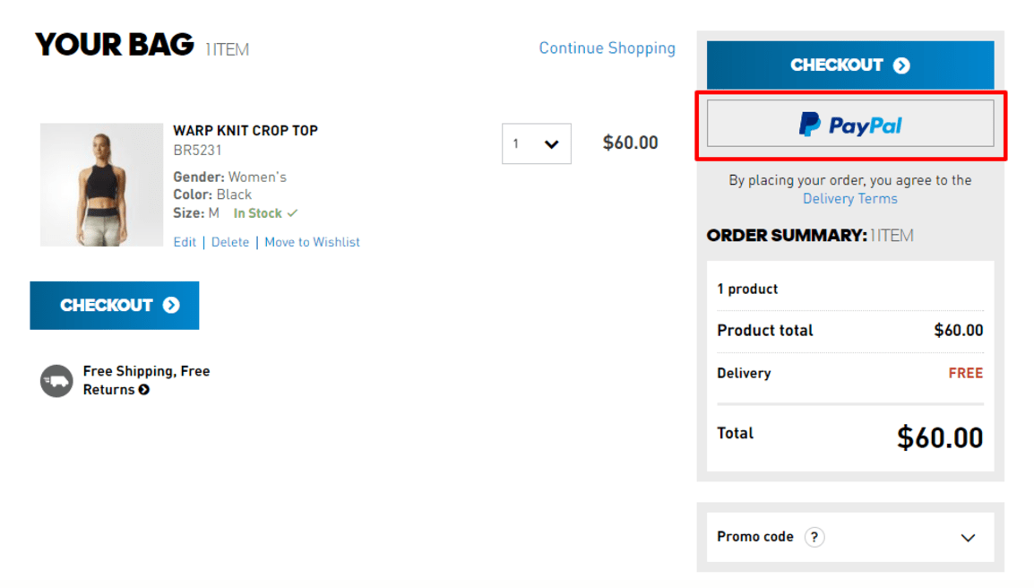
Option to enter PayPal from the cart page
By the numbers:
| 12 | 8 |
From Adidas.com:
What we say:
Most sites are doing this and we have seen a consistent lift when adding this across our eCommerce testbed.
Save for Later
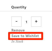
Offer to save the product in the cart for later
By the numbers:
| 11 | 8 |
From ModCloth.com:
What we say:
This is a feature users respond really well to but has not yet taken hold in the industry. Best in Class sites are doing this at a higher rate than the average site out there, so get on this trend now so you can capture more abandoned carts, build your email buckets, and cash in on those cross-device shoppers.
Has a “Candy Rack”
i.e. Recently Viewed, Wishlist, People Who Bought…
By the numbers:
| 11 | 8 |
From Sorel.com:

What we say:
Most of the sites that aren’t doing this don’t have a good way of populating a “candy rack” – REI and Walmart need a higher level of intelligence to get the right product in front of shoppers due to the breadth of their offerings. Other stores like Nixon or Glasses USA is unlikely to sell you another watch or pair of frames. Whenever you can get relevant products in front of users, however, this has a high likelihood of increasing AOV – especially if they are no-brainer accessories you know the user will need or want with their purchase.
Promotional Code Redemption Field
Overtly offers the Promotion Code field to the point of distraction
By the numbers:
| 7 | 12 |
From CrateandBarrel.com:
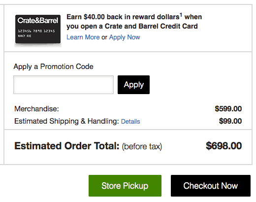
What we say:
Ideally this field is behind a click to avoid distracting users who aren’t looking for the field. Once you send a user out to find a code you have significantly increased the likelihood they abandon their cart. However, if your sales are coupon driven from your own catalog or, heaven forbid, posting coupon codes on your site, you will need to expose your coupon code field on the cart.
Deprecated Navigation in Cart
Navigation is simplified to only the essentials
By the numbers:
| 5 | 15 |
From Nixon.com:
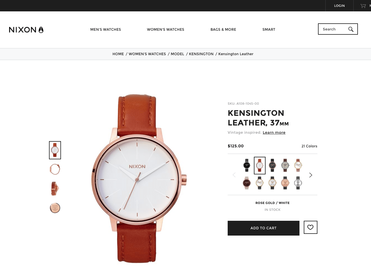
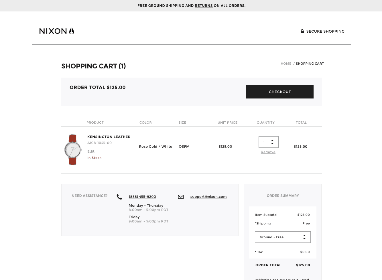
What we say:
While you should take your full site navigation (i.e. Mega Menus) off your Checkout pages to reduce distractions in most cases, doing it in the cart is another matter unless, as validated by ⅔’s of our list keeping their full navigation in the cart. Those that do not have low average order quantities (i.e. GlassUSA.com – how often do people buy more than one pair of glasses?) or have a full and complete “bag” pop-up before the cart (i.e. JCPenny.com).



0 Comments