*Looking for our most recent Best in Class Report? Check out our 2024 announcement here.
You might notice that our yearly Best-in-Class Research Study for 2019 looks a lot different from the Best-in-Class study from 2018.
What’s the big change?
In 2019, you can’t be “Best-in-Class” if you have major discrepancies between your desktop and mobile site.
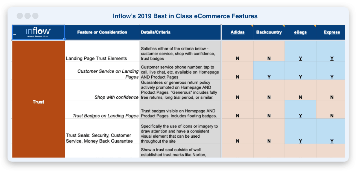
This year’s report combines mobile and desktop into a single 154-point matrix breaking down the most important features an eCommerce site should have in 2019.
Our matrix this year is mobile first: since Google now uses mobile as its first priority to index and rank your site, so do we. If your eCommerce site has a feature on desktop but not mobile, you didn’t get a full “yes” rating from us.
In 2019, users engage brands, not websites. Your cross-device experience needs to be consistent. That’s why the 2019 Best-in-Class Matrix reflects total web presence, with priority now given to the mobile experience.
Access the Full 2019 Best-in-Class Matrix
Previous Years:
- Inflow eCommerce Best-in-Class Research Study, 2018
- Inflow eCommerce Best-in-Class Research Study, 2017
What’s New in eCommerce and the Best-in-Class Report in 2019?
Our “Best-in-Class” analysis starts by building a master list of the best eCommerce sites based on our experience, what we hear from clients, and even our opinions. We then assemble our expert panel to narrow the list for our review.
Since 2013, we’ve assembled our annual Best-in-Class matrix by having our conversion rate optimization (CRO) team survey these sites, feature-by-feature, giving a “yes” or “no” rating to each one. Then we use these metrics to evaluate the latest trends among the top eCommerce sites.
In previous years, our matrix included 20 examples from desktop sites as well as 20 eCommerce sites on mobile. While there would be some overlap, we still compiled two separate lists.
For 2019, we’ve combined them into one. That means a few sites have fallen off our list, including Dollskill.com and BrasNThings.com—and you’ll see a few reasons why later.
That brought the total number down to 25. That meant some cuts. But some new sites with strong mobile presence also entered the list, including:
- Ebags
- Hydroflask
- Warby Parker
- The Shade Store
- Prana
- The North Face
- Backcountry
- J. Crew
- ThirdLove
- Lululemon
What We Changed in 2019
We conducted most of this year’s analysis on mobile devices, then validated them on desktop. In previous years, we split these two variables on separate tables. Now, to receive our “yes” in any given feature category, your eCommerce feature has to be present in both.
But that’s not the only change in 2019. We’ve also made the following improvements:
Reorganizing categories.
We’ve updated our category structure so you can view important elements like Trust or Customer Support in aggregate. Previously, we went “Page-by-Page” with each eCommerce site—the checkout page, the home page, etc.
Now we group our features by distinct themes so they’re easier for you to browse.
Increasing detail.
In our 2018 matrix, we included a single row for “Free Shipping”. That’s not enough.
Rather than ask if free shipping is merely available, we’ve gone a step further in 2019, including asking:
- Does free shipping require your order to meet a certain dollar threshold?
- Does the limit require membership?
- Does a site offer free returns as well?
This helps expand on the quality of each feature, rather than simply denoting its presence.
Removing a few sites.
One prominent example of a site that fell off the list this year: DollsKill.com. Dolls Kill’s mobile site was not cohesive, missing a lot of the tools that aid in navigation in 2019. The entire site is built around the concept of “Dolls” as different style choices, however there are none to be found in navigation and they aren’t clearly messaged on the homepage or throughout the site either. Other elements like unintuitive product recommendations or missing the best practice of “0 in cart” suggested that DollsKill has fallen behind compared to other sites on the 2019 list.

BrasNThings.com also lost a lot of features: no “0 in cart,” no category navigation, and issues with displaying sizing availability in their product gallery. The product pages are not optimal, with important selections and calls to action well below the fold. We also found bugs on their site such as formatting problems on the cart slide-out, broken images, and toggling items-per-row on mobile. That won’t cut it in 2019.
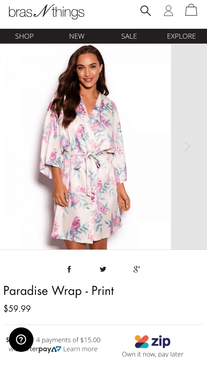
This year, the name of the game is mobile compatibility and function. If you didn’t have it, you weren’t included in our Best in Class list.
[section class=”wc-shortcodes-box wc-shortcodes-box-primary” align=”center”]Note: Want to talk to our CRO team (who performed this study) about how your site compares to the best in class? Reach out here or schedule a call above. [/section]
Top Emerging eCommerce Trends from the Past Year
In comparing 2019 to 2018, we spotted some interesting trends. You can download the full report to spot many of these trends for yourself. Below, you can see how many out of our 25 Best in Class eCommerce sites included the following features:
#1: Expanding on Basic Product Reviews
Product reviews are great social proof for any eCommerce company, but today’s user expects more. That’s especially true when your competition is utilizing the following variables:
- Q&A elements. What have other users asked about this product before, and what do the answers tell you about the product quality?
- “Showrooming.” In our “Help with Showrooming” row of the 2019 report, we asked whether the eCommerce site included details like how the product fits. What size is the pictured model is wearing? What are other users saying about the fit of the clothing? More of your competitors are offering this information than ever before, and customers find it valuable.
Best-in-Class eCommerce Sites with Showroom Features:
Total Yes: 16
Total No: 9
#2: Facilitating Navigation
You saw DollsKill and Bras N Things drop from the list, partially due to navigation issues. The increased emphasis on mobile users means that you have to facilitate what they’re looking for as they tap their phone:
Subcategory navigation is the big trend now. We found that this is so common that nearly all of the Best-in-Class sites considered now offer some degree of subcategory navigation on mobile. That changed in a hurry, as less than half of the sites examined last year utilized subcategory navigation.
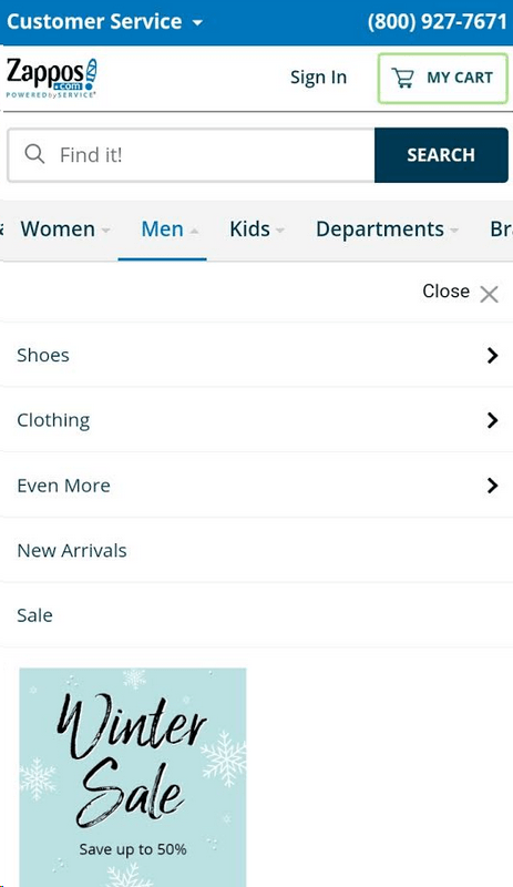
We also started tracking for a Mega Menu this year. (Note we are defining a mobile “mega menu” as the navigation functioning the same as desktop with the top categories across the top, and sub-category navigation dropping down when categories are selected.) Many of the sites still aren’t utilizing Mega Menus on mobile, even though this is an element we at Inflow have tested with success.
For example, Zappos created exceptional mobile navigation by incorporating both Mega Menus and Subcategory elements so you could bring up the following with only two taps:
Mega Menu:
Total Yes: 8
Total No: 17
#3: Mobile Parity
You’ve already heard about the importance of matching your mobile experience with your desktop. Let’s take one example that demonstrates why this might be important.
In Row 64 of the 2019 Matrix, you’ll notice we looked for the element of Swatches on the Gallery. This turned out to be a key flag for emerging mobile trends: while many sites have used this feature on desktop, we noticed that more eCommerce mobile sites are starting to catch up.
You can use an insight like this by following the best practices of a site like ThirdLove.com, which incorporates whole product images for each color swatch. ThirdLove.com demonstrated one of the top emerging trends all year: features previously available only on Desktop are moving to mobile.
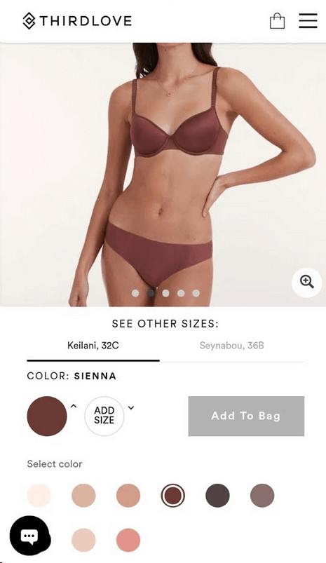
This trend also demonstrates how important it is to incorporate your favorite desktop features into your mobile presence. There are still opportunities to stay ahead of even the Best-in-Class if you emphasize migrating your favorite desktop features over to the mobile side. Our conclusions lead us to recommend that any eCommerce brand does this as much as possible to stay ahead of the curve.
Swatches on the Gallery:
Total Yes: 13
Total No: 12
The Biggest Declining Trends in eCommerce
The Direct Path from Homepage to the Product Page
It’s not always necessary to create a direct path to a product page from the home page, especially if you have a large catalog in the first place.
If you compare the 2019 Matrix to the 2018 version, you’ll find the trend has waned a bit. The top eCommerce sites were constructing direct paths almost universally in 2018, while this year, they dropped closer to 50/50. In our experience testing this, a larger site or catalog will have more trouble putting the right products in front of the right people.
What should your site do? It’s something that needs testing on a case-by-case basis; you might want to reach out to us for more insights if you’re unsure what to make of this trend.
Direct Path from Home Page to Merchandise:
Total Yes: 14
Total No: 11
Video and 360 Product Views
Most sites in 2019 were content to offer static images. They’re easier to fill in as they’re cheap, they’re simple, and providing full video or 360-degree functionality can become prohibitively expensive as your product catalog grows.
This trend may also stem from the increased emphasis on mobile: the necessity of loading video on mobile can distract the customer and get in the way of the shopping experience. We found that 360-degree views on mobile were rare, just like last year. Meanwhile, 2019 saw fewer Best-in-Class sites incorporating product videos.
Video on Product Page:
Total Yes: 6
Total No: 19
360 Product Views on Product Page:
Total Yes: 1
Total No: 24
Social Promotion, Sharing, and Signing In
There was a surprising trend this year: people are more distrustful of social links and sign-ins. Perhaps this trend reflects what we’ve seen in younger demographics for some time now: some research suggests that 1 in 10 users have deleted their Facebook accounts, while a Pew Research survey put the number at about 1 in 4. Poor P.R. for platforms like Facebook have made people in the 18-29 demographic skeptical about social sharing and sign-ins.
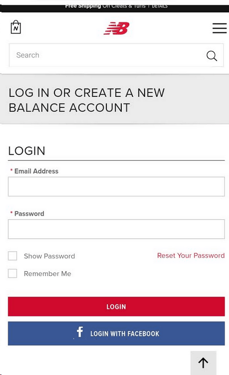
Above: Social sign-ins can influence mobile trust even if users have their own account.
Lower trust for Facebook sign-ins can affect how mobile users see your brand. One thing we’ve found at Inflow is that if you show a trust seal that people already don’t trust, it will hurt your overall trust as well.
This means that even if you give users the option of a conventional log-in, you have to be wary of the effect of social promotions, sharing, and sign-ins.
Social Promotion:
Total Yes: 3
Total No: 22
Social Sharing:
Total Yes: 6
Total No: 19
Social Sign-Ins:
Total Yes: 4
Total No: 21
Trends to Watch and Test for Yourself
Image Zoom
The overall trend in image zoom in 2019 was similar to last year’s: most eCommerce sites let you zoom in on an image, even in their mobile presence. The temptation is to view this as a stagnant trend and lump it in with “360 view” and product videos as not as important on mobile.
That’s a mistake. Because users can’t feel the products, they need to be able to see detailing like stitching and the quality of materials. The ability to zoom in on an image won’t be cost-prohibitive like video or 360 view, but could give you a distinct advantage over other products, especially in specific categories like clothing.
Image Zoom:
Total Yes: 19
Total No: 6
Discount Pricing
How should you frame your discount: as a percentage or as a dollar total?
Our results in 2019 suggest that this needs to be tested in every case. The top eCommerce sites in our Best-in-Class Research Study were split down the middle. Whether you choose to display a percentage or a dollar total for your product discounts will depend on your business and how large the individual discounts are.
There is a lot of price psychology that goes into factoring in this variable. Before you make a decision, you’ll want to dive into the research Matrix for 2019 yourself and see what companies like yours are doing.
Stating Savings on Product Page:
Total Yes: 9
Total No: 15
Total N/A: 1
Final Pricing in the Shopping Cart
Free shipping continues to be a top trend in eCommerce sites, which ties into the concept of final pricing: the more simple you can keep your shopping cart experience for the customer, the better. The top eCommerce sites in our matrix tend to display final pricing in the cart so there are no surprises for their customers.
Final Pricing in the Shopping Cart:
Total Yes: 19
Total No: 6
The Inflow Best-in-Class Research Study, 2019
Our report of 154 separate variables in eCommerce best practices includes explanations, even more trends, and more specific feature details than ever. But there’s one key change:
Mobile rules the day in 2019.
We’ve combined the desktop and mobile matrixes to deliver even more specific details in a more intuitive way. How can you tell which trends will have the greatest impact on you? Which of those “50/50 decisions” do you have to test, and what are the top eCommerce sites in your industry already doing?
View our grid of key features and see how today’s top brands have handled the shift to the “mobile-first” strategy—and how you can too:
Note: Want to optimize your site to make it best in class? You can talk to us here or schedule a call above.


Thank you for sharing! Will you make a 2020 best in class?
Unfortunately, we didn’t get around to a 2020 Best-in-Class (what a year it’s been!) but look for us to put together one for 2021!
Great report, thanks for putting together. Awesome for checking and comparing to what I am doing on my site. In regards to the displaying price section on gallery pages where would you place those stores that display product price on hover and what are you thoughts on this? Thanks.
Thanks for reading Mike! For displaying prices, we would have counted those that only showed on mouse-over based on the descriptions, so if on mouse-over the sale price was shown with the regular price crossed out, that line item would have been a Y.
That said, we generally don’t recommend doing all prices on mouse-over. This makes it much more difficult for a user to browse the catalog, forcing them to mouse over every product they might consider. I would only do this in rare situations, where users are less price conscious and/or you allow for very easy filtering or sorting by price.
Hope this helps!
Hi. Thanks for publishing this report. The information is awesome!
One request. The current format is very difficult to use. As I scroll down the header rows disappear making it very difficult to match up what I’m looking at with the reviewed sites (or anything else in the header).
Would it be possible to lock rows 1-3 and column A? It would be so much easier to use if I knew what I was looking at and didn’t have to scroll all around to figure it out.
Really appreciate all the work that went into this document!
Hi Craig,
Thanks for your feedback!
We used the publish feature of Google Sheets to share the matrix this year and unfortunately, it looks like the “freeze panes” functionality didn’t carry over. We’re sorry that this has resulted in a less-than-stellar user experience.
We’ve added a link in the top left corner of the matrix that will allow you to download an Excel file (which is setup with those rows and columns already locked in place) so that you can use the matrix however you wish! 🙂
Thanks Keith!
Will you make a 2019 best in class?
Hi Albe,
Good news! Our team is just finishing up our 2019 Best in Class matrix. Keep an eye out for it in March! 🙂
Thank for sharing the list of eCommerce sites with really useful information. I have learned a lot of things from here. Nice work.
Hi Keith,
I have in recent years done a lot of consulting in conversion optimization and often returned to your Best-in-Class eCommerce List. As usual inspiring and instructive.
A common question our clients have is (both those who are about to set up medium-sized eCommerce sites and those who are running for some years): “Which ecommerce content management system should you choose to get the best possible CRO?!”. Is there any with built in A/B-test tools, personalization or other CXM stuff?
Which CMS uses for example the sites that are in your best-in-class list?
What is your recommendation on CMS that is best suited for ecommerce?
Thanks for a good article!
/Benny
Hello Benny,
Great questions. I don’t believe there is an answer as to which eCommerce CMS is best for Conversion Optimization, as each eCommerce site is different and more important than the CMS is giving the user what they expect and want (this is very complex to explain in further detail, but I hope you understand). We have never met a CMS that did not need custom development additional to it to convert better. We have often dreamed of partnering with Magento or Shopify to make them sell better out of the box, but that is not because we prefer these CMS’s, but because so many eCommerce sites use them.
As far as CMS’ with A/B Testing tools, no, I know of none, and would not expect any to do a good job of it (the test vendors don’t really do a good job at it now, so having a CMS get it right would not be expected).
Right now, I like Shopify! I know its not the best solution for everyone, and I have not interrogated it for every aspect of success (Technical SEO for example), but in the experience I have had, it comes out of the gate really strong and gives us something to work with. Hope that helps.
Love this list. Being able to reference effective ecommerce sites to model your own off of is so underrated and very valuable. This list is very useful for our members at Cooptimizers, we will be sure to send them this way as a reference. Thanks!
Hey Stephen,
Glad you like it. Yes, I home your groups find it useful. Make sure they also check out our other eCommerce case studies.
What 13 sites were included in the comparative analysis?
Hello Elle,The 13 sites included were:
www.hayneedle.com
www.wayfair.com
www.underarmour.com
www.modcloth.com
www.gettington.com
www.newbalance.com
www.officedepot.com
www.canadiantire.ca
www.walmart.ca
www.zappos.com
www.backcountry.com
www.uggaustralia.com
www.ctshirts.com
You can see a feature by feature score card by clicking on the links at the top of the Comparative Analysis Spreadsheet.
I could not see the the comparative analysis spreadsheet. Is there another link by chance?
Zain,
Google Docs was buggy yesterday for many people we spoke with. Please try again and let us know if you have any trouble. We apologize for the inconvenience.
The spreadsheet still doesn’t open. Google Drive says it’s been deleted 🙁
Hello Idris,
I think we’ve found the problem and I’m emailing you a direct link. Thanks for letting us know!
Great list and congrats to those who made the list!
Keith, this is a great list of your picks of best in class for CRO. Brilliant. And thank you very much for becoming a contributor to the new Australian eCommerce Guide. Your fame and expertise is spreading far and wide… 🙂
Cheers
Richard Keeves
Publisher, Australian eCommerce Guide
@AuseComGuide
I’d be curious to know what you think of the PSD2HTML website. I know they aren’t as main-stream as the sites you’ve looked at for this article, but I’ve always found their site to be shockingly well designed for conversion.
Hello James,
Just to make sure we have the correct site. Is that psdhtml.pro?