Attracting a customer to your site and convincing them to purchase your product is critical for eCommerce businesses — but these steps alone don’t guarantee a sale.
For most websites, it’s the shopping cart and checkout page design and functionality that ultimately make or break a customer’s purchase.
So, how can you optimize your guest checkout flow to make that sale and simultaneously increase your average order value (AOV)?
Every year, our conversion optimization team analyzes leading eCommerce sites across dozens of categories to identify the best practices for customer conversions.
Using that data (and our decades of experience optimizing clients’ sites), we’ve created this guide to eCommerce checkout design and shopping cart best practices, complete with real-life examples of them in action across our 2024 set of studied sites.
Read through them below and start testing your favorites on your website today. Or, if you’d like a custom conversion optimization strategy for your online business, we’re always happy to chat.
Inflow’s Best Practices for eCommerce Shopping Cart & Checkout Page Design in 2023
Before we get into our recommendations, keep this in mind: Conversion rate optimization isn’t an exact science — that is, what works for one site is not guaranteed to work for another.
Before you start implementing all of these cart and checkout optimizations on your site, create a testing plan. Choose one strategy to begin with, try it out on your site, and come to a conclusion before throwing more changes into your eCommerce checkout process or shopping cart page design.
That way, you can better identify exactly what does (and what doesn’t) move the needle for your customers.
Build a comprehensive testing plan by downloading our complete 2023 Best in Class research report now.

5 Shopping Cart Page Design Best Practices
- Keep users on the product page.
- Show product attributes in the cart.
- Add a virtual “candy rack.”
- Show final pricing in the cart.
- Allow customers to save for later.
1. Keep users on the product page after an “add to cart.”
Keeping a customer on a product page (instead of taking them to a separate cart page) has been a dominant trend among eCommerce sites since we first identified it in our 2018 research.
Preemptively sending customers to a shopping cart page can cut short their browsing experience, which can be particularly harmful to your AOV.
Our rule of thumb: If your eCommerce website averages more than 1.6 products an order, keep customers on their initial product page — to encourage them to keep shopping and adding to their cart.
There are three standard styles for doing this:
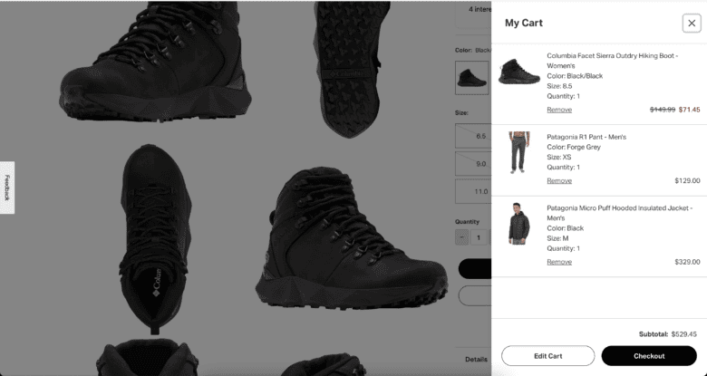
1. A drop-down bag, as shown in this example from Chewy:

2. A lightbox-style pop-in layer, as shown in this example from Best Buy:

As you can see, a pop-up layer like Best Buy’s allows for additional cross-selling and upselling opportunities, which makes it a more popular option for our clients.
3. A slide-in bag, as shown in this example from Backcountry:
2. Show product attributes in the cart.
When you have similar products that may differ on one or more attributes, we recommend showing those attributes (fabric, finish, size, etc.) with the product name and picture in the customer’s shopping cart.
This assures users that they’ve selected the right product, eliminating a potential barrier to purchase and reducing the “wrong items” returns for your customer service department.

3. Add a virtual “candy rack.”
Just as brick-and-mortar stores take advantage of checkout lines to display last-minute purchases like candy and magazines, you can use your shopping cart page design to upsell additional items to your online shoppers.
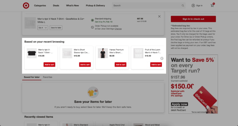
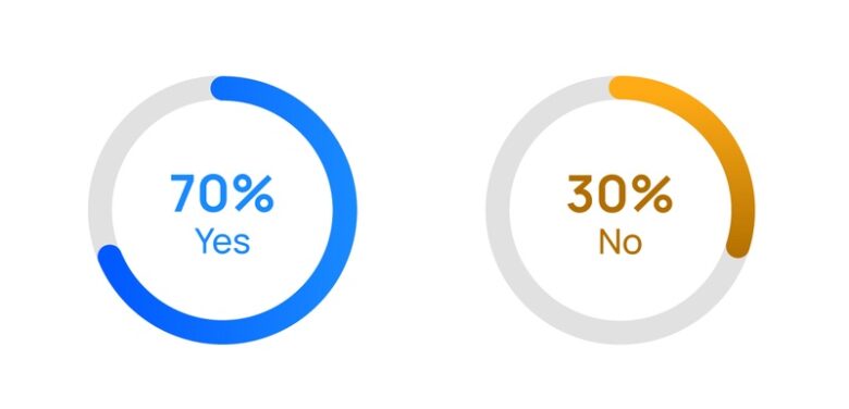
It’s not just about showing any old products to your customers. You’ll also be more likely to increase AOV when you provide relevant, attractive products in this upsell area. (That’s why 70% of our studied sites present cross-sell options based on the products already present in the shopping cart.)
Big-box stores that sell lots of products (like REI or Walmart) need a higher level of intelligence to get the right products in front of their shoppers. Similarly, if you’re shopping at Nixon or GlassesUSA, you’ll be unlikely to add another watch or pair of glasses to your cart after you’ve already selected one.
Use your customer data to identify products typically bought together, and offer those up to shoppers when it makes sense to do so.
Learn more about offering relevant cross-sells (including how we used them to boost one site’s conversion rate by 3.3%) in our complete guide now.
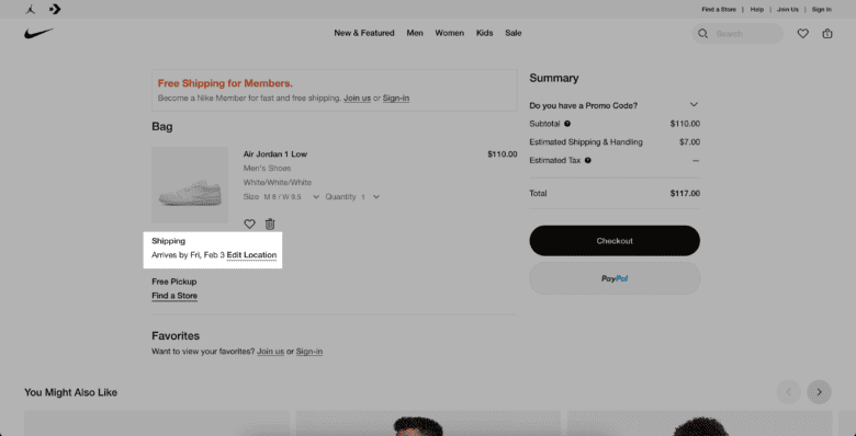
4. Show final pricing in cart.
No customer likes sticker stock, so make sure your shoppers are continually aware of their final total cost (or at least an estimate) from the moment they add their first product to their cart.
Make sure this number changes in real-time (and, if possible, incorporates any discount codes, promo codes, or shipping costs) as customers add more products throughout their buying experience.
Bonus tip: Display your credit card and preferred payment methods early on to avoid any disappointed shoppers. We recommend incorporating “buy now, pay later” payment methods, especially if your store sells higher-priced products.
5. Allow customers to save for later.
Depending on who you’re talking to, the online shopping cart abandonment rate is anywhere between 60–80%. So, your eCommerce shopping cart page design can’t just focus on conversions; it should also offer opportunities to re-engage those users who won’t complete their purchases.
We suggest giving your customers the ability to save products for later. This is often accomplished with a wishlist function, which associates products with a customer’s personal account. (If they don’t have an account, adding an item to their wishlist will prompt them to make one.)

You can then use that data to retarget your customers with personalized email marketing, reminding them of the products they’ve saved and/or sending alerts when stock is low.
6 eCommerce Checkout Best Practices
- Display order summary throughout checkout.
- Autofill shipping and billing addresses.
- Provide estimated shipping and arrival date.
- Segment your customers with guest checkout options.
- Offer third-party payment options.
- Set expectations upfront.
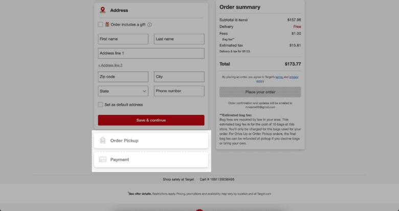
1. Display the order summary throughout the checkout process.
Today, it’s standard practice to keep your customer informed of their order summary throughout every step of the eCommerce checkout flow.
Shoppers want to be sure they are buying the right items. By reminding them of their items through every step, you prevent them from getting sidetracked and leaving the checkout page to double-check their cart.
Displaying an order summary also encourages potential customers to maintain an emotional connection to their chosen item through the checkout process.
Additionally, doing this allows you to bypass a review page. Unless there are important shopping details to confirm (such as prescription information for glasses orders), we recommend skipping a final review page to eliminate this extra step in the checkout process.

2. Autofill shipping and billing addresses.
There’s a reason why so many eCommerce businesses auto-select customers’ shipping and billing addresses to be the same: It makes the checkout process much easier for users. (We’ve verified it with our own testing, too).

Most customers will have the same billing and shipping addresses, so we encourage auto-populating or auto-selecting the second address form field on your checkout page design. However, keep this checkbox highly visible for the percentage of customers who will use two separate addresses.
3. Provide estimated shipping or arrival date.
Customers want to know when their orders will arrive, so we recommend displaying an order’s estimated shipping or arrival date within your eCommerce checkout page design.
“Estimated” is the key word here. Emphasize that dates are subject to change to prevent disappointed customers from bombarding your customer service teams.
Make sure to always follow up on order confirmations with shipping details and tracking emails to keep your customers in the loop.
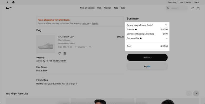
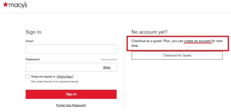
4. Segment your customers with guest checkout options.
Studies consistently show that a top reason customers leave abandoned carts is because of a “create account” prompt. This can be a difficult balance for online retailers, which have much to gain by gathering customer information through the account creation process.
And, while the majority of our studied sites this year do not allow guest checkout (likely because of their status as leading online retailers), this option remains incredible valuable for small to mid-sized businesses who cannot afford to lose out on sales due to checkout abandonment.
As a compromise between these two competing desires, we recommend “segmenting” your customers upfront by giving them three different options:
- Check out as a guest
- Create a new account
- Sign in to an existing account
You can see these options in action on Nike’s checkout page. Not only do they prompt users to create a new account, but they also highlight the benefits of doing so (free shipping).
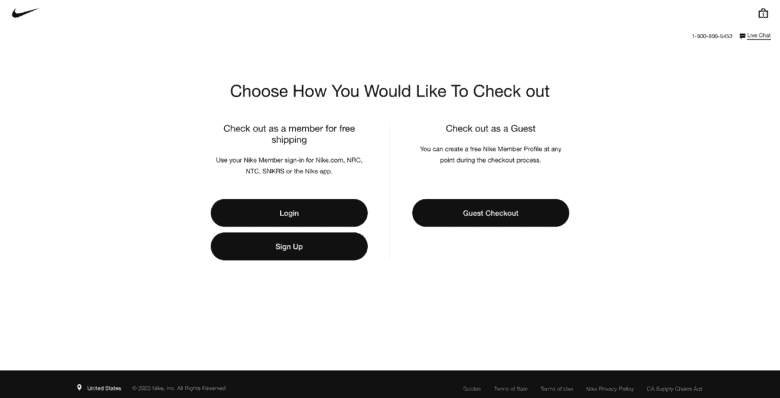
Other eCommerce sites choose to save the “create an account” step until the end of the checkout process. This can remove a barrier for new customers’ conversions, while still giving them the option to create their account after the purchase is complete.
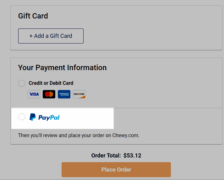
5. Offer third-party payment options.
With a growing number of shoppers forgoing traditional credit for buy-now, pay-later options like Affirm or Afterpay, offering a third-party payment option is a non-negotiable for modern online stores.
The more options you can offer your customers (including Amazon Pay, PayPal, Apple Pay, etc.), the fewer obstacles to purchase they’ll have — and the higher probability that they’ll convert.
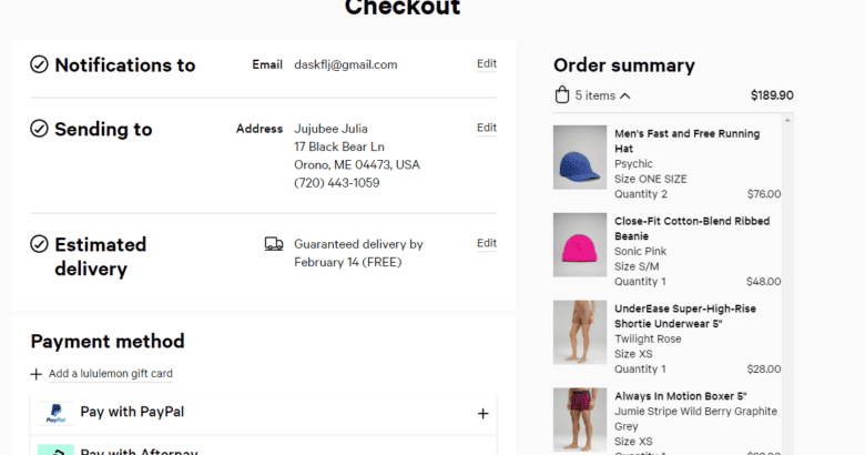
6. Whichever checkout process you choose, set expectations up front.
Whether you choose to use a one-page checkout process or guide customers through several separate pages, make sure your shoppers know what to expect. Be clear about how many steps there are in the checkout form, and keep the user informed about how far they have left to go with a progress bar.
If you have a multi-page checkout design, add numbers or steps to the headers/footers of each page as a progress indicator, as Lululemon does:
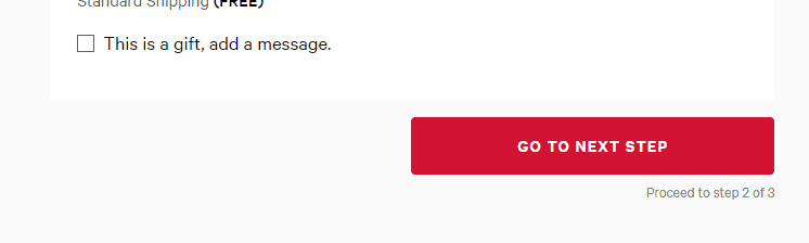
If you use a single-page checkout design, we recommend using the accordion style for a clean look. Leaving all data fields open to edit and view on one page can be overwhelming for customers who want a quick checkout process, especially when they’re shopping on mobile devices.
Test These eCommerce Checkout & Shopping Cart Best Practices Today
The 11 eCommerce cart designs and checkout page designs are modern standards we recommend to streamline your customers’ checkout experience and maximize your online sales.
But remember: Not all of these practices provide similar results for businesses.
As always when it comes to conversion rate optimization, make sure to test a few strategies individually to determine their effectiveness and what will work best for your eCommerce store.
If you’re not sure where to start, we recommend downloading our complete 2024 Best in Class CRO Report, where you’ll find more than 150+ data points to start building your testing strategy:
Download Our eCommerce Best in Class 2024 Report Now.
Want professional guidance along the way? Our CRO team can create a personalized proposal for your cart and checkout design, crafted to optimize your user experience and online conversion rate. Contact us today for a free website audit and customized strategy for your online business.
In the meantime, check out our other conversion best practices for eCommerce sites:
- eCommerce Upselling Strategies: The Complete Guide
- eCommerce Homepage Best Practices for CRO
- eCommerce Product Page Design Best Practices


Just brillant examples indeed! Coming from Sujan Patel’s recent tweet. It just awesome learning buddy. Gonna send a ptosal soon. Keep it up!
Have you checked out the new Amazon checkout process? I would say that would be the new norm.
They merged all three steps (previously on three pages) all into one page with dropdowns for each step.
It has both the flexibility of a full checkout process and the simplicity of a one-page checkout.
Great spot Stan! Amazon has the benefit of lots of repeat shoppers so they have some flexibility that smaller stores with fewer loyal customers do not, but it’s always good to know what to strive for. We have had success with a very similar accordion style checkout, which has tested well in the past. Keeping users on one page, particularly on mobile, generally is a win and this is a great way to do it.