The New Year is here, so it’s time to start thinking of ways to make your mobile experience better for users in 2017. I’ve compiled three rather simple ways to boost your mobile growth this year.
1) Free Your Mobile Menu
Don’t hide your navigation behind a mobile menu. If you do, people will never know what the navigation entails unless they click the menu, and I guarantee most people will try to navigate via the page they landed on (i.e., homepage), and fail before they even try the menu button.
So, there are two things you can do to facilitate (aka relieve) navigation on mobile phones, or any device, really:
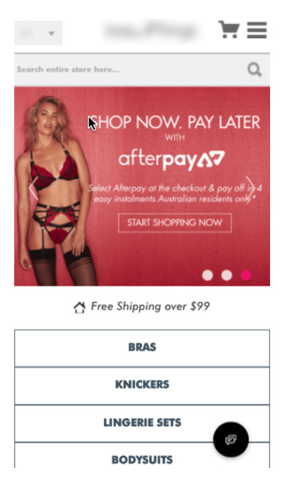
- Place navigation on the homepage that reflects the menu navigation. Go ahead and promote those specials all day long, but leave enough prime real estate on the homepage so people can navigate.

- Test giving your mobile site the same top navigation and Mega Menu style as your desktop site. That is right – you read it. Just to be clear, let me say it again: Test giving your mobile site the same top navigation and Mega Menu style as your desktop site.
Look, navigating on mobile is less than desirable, and the menu thing was figured out years and years ago on desktop, so why re-invent the wheel here? I know, I know, you are saying, “But Keith, mobile is different, it’s smaller than desktop. I don’t have the room!” To this I say, “It’s 2017, you have the room” and here is how:
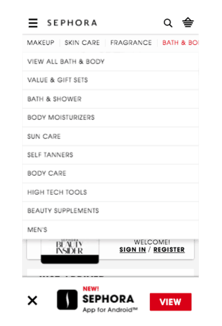
Take a look at Sephora’s mobile site and how it uses both a top nav menu and drop-down mega-ish menus. All it does to make “room” for mobile browsers is allow users to scroll to the right.

We have tested this type of navigation and it rocks. In fact, you may be able to eventually lose the “hamburger” menu entirely.
Appify your Site
It’s been abundantly clear for years that eCommerce site apps (not brick and clicks specific) were going to go away in favor of better websites. In fact, for a while, an eCommerce app’s only purpose was to push notifications to users because it was possible.
Now, with a few mobile-first strategies, an eCommerce site can appify itself so most of the benefits of having an app are there. (Psst, it’s all about getting them back to your site.)
-
Home screen Your Site (Mobile and Tablet)
Instead of promoting an app download at the top or bottom of your mobile eCommerce site, simply change the wording to “Add Us to Your Phone” with a button “Add Now.” When a user clicks, your site’s Favicon will be added to the phone’s home screen as if they instantly installed an app from the app store.
This has a lot of benefits:
- Your brand just got put on something that a prospective customer looks at 40 times a day, reminding them that you exist.
- It gives them instant access to get back to the store without having to open a mobile browser and retype your site’s URL.
- You will get “cool points” for doing it when no other site can.
- You can use it strategically on product pages as a bookmark.
- You can give the return URL tracking code to see how much revenue it can be associated with (and skinny down the inflated direct channel in Google Analytics).
This will become increasingly common as more retailers built Single Page Application (SPA) websites.
-
Push Notifications via Chrome & Firefox (All Devices)
More than half of mobile users have Chrome as their main browser and a few use Firefox Mobile. This means you can notify them using Push notification tools like PushCrew from Wingify. Tools like this not only solve a problem on mobile, but they also work brilliantly on desktop and tablet as well, allowing you to notify more people than ever without having to build and maintain mobile apps.
-
Bookmarklets (Desktop & Tablet)
Bookmarks are back and they convert really freak’n well. Unlike the old days (think 1999) when “Bookmark this page” links were needed to help users learn how to be online, today’s generation of bookmarks are there to assist online shoppers weed out the stuff they might want from the stuff they don’t want.
Below is a simple button I use for eCommerce product pages.
 This has a lot of benefits:
- Your site’s favicon get’s put in the user’s desktop and mobile browser bar, staying front and center for weeks, perhaps months and years to come so users can remember and get back to YOUR product on YOUR site easier.
- Its cool to drag and use.
- You can track it with Analytics so you can see its impact (it will be significant if your product factors high for consideration time).
Add PayPal Already
I don’t want to tell you to get PayPal. I don’t want to tell you that adding it as a payment method is important, or that it makes people feel safe, or it is highly appreciated for its convenience. So, I won’t. I will just tell you how to do it right so your attempt to implement it does not go down the tubes as a wasted and expensive effort.
I want you to implement PayPal like everyone else, THEN cover these two bases:
- Leverage the PayPal App – If someone has it installed on their phone, ensure the app is used to checkout and don’t force them through an online experience. The App converts higher.
- When the user comes back to the site from PayPal, let them know that their PayPal payment has been applied.
Those small changes can be huge for your mobile site. Get these changes in action and see major growth in 2017.


0 Comments