First of all, we have a new website, so please check it out! It’s responsive. And adaptive. And sometimes dynamic.
[section class=”wc-shortcodes-box wc-shortcodes-box-primary”]TL;DR
Going adaptive has allowed us to solve a few important problems, like customizing the user experience by device type and paving the way for a faster mobile site. It has also introduced new complexities, such as Vary response headers (and the potential effect on caching), and multiple versions to maintain on key pages (for dynamic content). We’re continuing to evaluate page-speed, caching, conversion rates, rankings, etc., and will update our readers as we go.
[/section]
Most pages just stack differently as the screen size changes (responsive). Nearly all pages adapt with server-side JavaScript depending on the device type (adaptive). Others adapt using a separate code base specifically for mobile visitors, allowing us to serve different content or an altered user experience (dynamic).
In other words, pretty much every part of the graphic below applies to our little website (with the exception of “mobile subdomain/directory”). In this post, I’ll explain what all of it means, and some of what we learned about adaptive website design when building and launching the new site.
The image above is from a post we published back in January 2015. Not much has changed since then in terms of the advice found within that post, but we’ve finally put some of the “adaptive” stuff into practice on our own website. We’ve learned firsthand that a custom mobile strategy may take bits and pieces from each approach. For example:
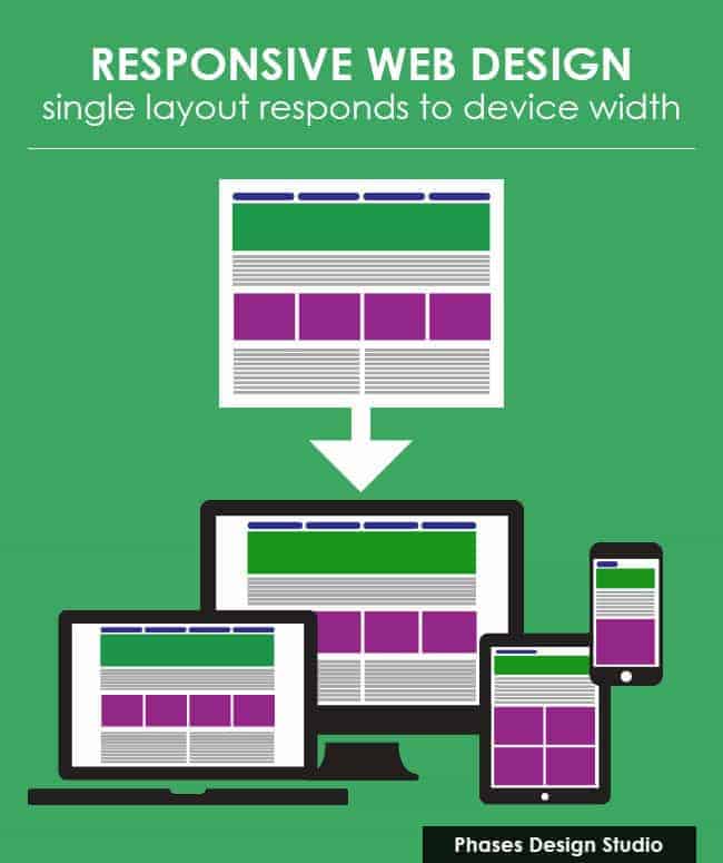
Technically speaking, the entire website is responsive to varying screen sizes. All this means is that page elements should resize and restack (in a “fluid grid”) as the screen size gets smaller.
Technically speaking, the entire website is also adaptive because of little features like turning the “Schedule a Call” button linking to our consultation page in the desktop header into a “Call” button with click-to-call functionality on mobile (more adaptive features are discussed below).

While our site adjusts in a fluid grid to handle screen sizes responsively, some pages also adapt dynamically to display different content to different users, depending on their device type. This goes beyond the button change above, which is handled with JavaScript, and into some dynamic features requiring separate code bases.
The Reality is a Little More Complicated
While server-side scripts take care of sitewide adaptive features, like updating the header and certain forms, most of the pages are built in the WordPress back-end as responsive pages. This includes all blog posts. What I mean is there is only one version of the post/page to edit. These would fall under the second column in the image above (Responsive with Adaptive Logic via JavaScript).
Other pages, such as those in our Services section, are fully dynamic and require us to build and maintain two versions of the page (one for desktop and one for mobile). For example, our eCommerce SEO Services page loads much less content for mobile users. #SEONote – This content is NOT in the source code on mobile pages (i.e. it’s not just being “hidden”).
Confused yet? Pierre Far has this summed up in a way that might help now that you’ve read the background info above:
@dr_pete @balibones 2/ Definitions are easy. If CSS only modifies layout, RWD. If JS, adaptive. If serverside, dynamic serving.
— Pierre Far (@pierrefar) October 24, 2016
Thanks Pierre! SO we’re modifying the layout with CSS (fluid grid) so it’s responsive web design (RWD). We’re using JavaScript to adapt certain other features to mobile (e.g. buttons). And we’re dynamically serving different content from the server depending on device type. It doesn’t have to be a simple one-or-the-other proposition. You can make some of those decisions based on page-type, taking into account the pros and cons of each approach.
Let’s look at some real examples of the dynamic features, which I think will help further explain the difference between dynamic, adaptive and responsive.
Desktop vs. Mobile Screenshots

The “Speak With Us” form at the top of the Desktop version (above) is removed from Mobile (below). Also, some text is removed from mobile.

The first paragraph of text under “Technical eCommerce SEO” is removed on mobile.

Mobile visitors have much less text to read.

The last two paragraphs in the desktop screenshot below don’t exist on mobile.

How do you think Google will handle this? Did you hear they’re separating the mobile and desktop indexes? This could make for an interesting experiment. We’ll keep you posted.

The last two paragraphs above don’t exist on mobile. Will the mobile version rank for phrases that appear in the desktop version only? Let’s find out!

“Technical SEO” was definitely a good keyword for this Services landing page, which informed our choice of text for the Case Study section header below.

We’re testing a more compelling header for mobile, but where did the “keywords” go?

What’s Next for This Page:
Now that we have most of the basics working properly, we’re going to start taking advantage of the adaptive technology to improve mobile page load times. We already display less content, but are also going to be providing different image sizes (currently they’re using the same image files) since desktop requires much larger images than we need to have on mobile.
The Two Biggest Downsides of Building an Adaptive Website
Developers may have their own issues, but from the perspective of a marketer, SEO, writer and editor, these are the things I want to warn you about:
1) You may run into trouble with the Vary HTTP Response Header
Check with your host first
Not all hosts are going to allow you to change this easily, and those that do, may not allow you to change it on a page-by-page basis, meaning the entire website would have the same Vary header response. If you have direct control over your .htaccess file, you should be able to update the header response.
Do not remove the other Vary responses
I made the mistake of asking our developer/designer, Kandra, to “replace” the Vary: Accept-Encoding response with Vary: User-Agent. This caused us to launch with an even slower site than before since we were no longer serving compressed files. Learn more about why Accept-Encoding is important. Luckily, Kandra noticed the error, brought it to our attention and now we return this:
Vary: “User-Agent|Accept-Encoding”
Pay Attention to the Number of Cached Versions
Vary User-Agent is the response Google recommends we use when dynamically serving different content to different users (in part, to avoid being seen as “cloaking”). What Google doesn’t tell us is that there are thousands of different possible user-agent combinations (every possible browser version and every possible OS version) and that your content delivery network (CDN) may create a new cache for each one of these.
In a Fastly article from 2014, about 8,000 different user-agent combos were found in a sample of 100,000 requests. Browsers and operating systems are proliferating much faster than they are deprecating. I’d expect that number to be even greater now. If every one of these combinations gets its own cached version of the page, that could pretty much render your CDN useless – potentially even slowing the site down more than if you weren’t using one.
I’m keeping my eye on this one. We’re letting the caches roll at the moment, but are looking into a solution like the one below, which would limit this to two caches (mobile and desktop):
[section class=”wc-shortcodes-box wc-shortcodes-box-primary”]
if (req.http.User-Agent ~ "(Mobile|Android|iPhone|iPad)") {

set req.http.User-Agent = "mobile";

} else {

set req.http.User-Agent = "desktop";

}
[/section]
2) You’ll have two versions of each adaptive/dynamic page to edit.
This is why only certain pages on our site are fully adaptive. The majority of our indexable pages require only one version of the content in a responsive grid pattern, with minor changes made via server-side JavaScript (e.g. the click-to-call button on mobile). Those that are adaptive, like the SEO Services example above, are key pages on which we’d like to obtain the highest possible conversion rates from both desktop and mobile traffic.
Limiting the amount of fully adaptive pages allows us to have a dynamic website without as much work. We’re talking about a dozen pages that require two versions, as opposed to the 500+ we have indexed in Google. Meanwhile, the entire site uses the Vary: User-Agent header response due to the sitewide changes we make to mobile content with server-side JavaScript.



0 Comments