As part of our continuing work compiling data on the Best in Class sites on the web, we’re breaking down common features for each section of an eCommerce site. For a review of the features that make up a best in class Homepage, check out previous posts in the series here. This post focuses on what is arguably the most important experience on your site – browsing and finding products.
Gallery Product Display
There are a few conventions here that you’ll see just about everywhere, and a few new features that are starting to gain traction to help keep you ahead of the curve.
Every gallery page on the sites we reviewed include some pricing information. Sometimes this comes in the form of a range, like on products where different sizes or configurations have different costs, but some level of pricing information is always available. Less consistent is the messaging around sales and discounts – only 13 of the 20 sites reviewed included messaging around sale pricing. Often what you do with this will be determined by the level of discount – the sites that were not displaying sale pricing were likely to have very little difference between the regular and sale prices.
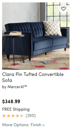
Another interesting trend we’ve noticed here is that sites have been slow to adopt adding color swatches to gallery pages – only 7 of the 20 sites reviewed on mobile include color swatches in the gallery, and desktop is not too far ahead. In testing we’ve seen this consistently move the needle, so if you have items that come in multiple colors be sure to put that info in front of users before the PDP. If, however, you can’t use swatches, Wayfair is giving the cue another way – see the screenshot below or check out the site for more examples.
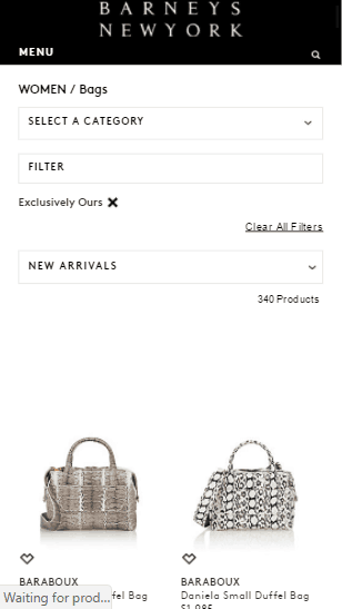
There are also a few specific considerations to keep in mind for mobile. First, unless there is a need to see significant detail in your images on the gallery, it’s best to allow for 2-wide category grids. Of the mobile sites reviewed 16 of them are doing this, indicating a strong convention here. By displaying 2 items per row you allow users to see more product and reduce the need to scroll.
The other mobile-specific consideration involves Quick View. While 7 of the sites on desktop are still doing this, only 1 site is doing this on mobile. There is too little screen real estate to make this feature worthwhile on mobile, and it saves too little time to make up for the poor experience. Even on desktop the trend is moving away from using Quick View, so if you don’t currently have this feature, focus your efforts elsewhere.
Faceted Navigation
This is important enough to your gallery experience that it has to be broken out into its own section. If you have more than a page of products and aren’t doing this, you need to be. There are 2 important things we identified here that the majority of the best sites do.
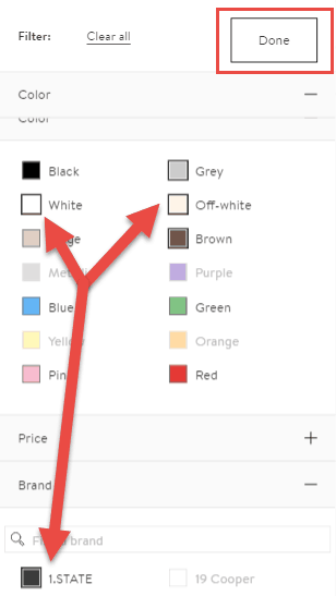
First, including the color cue along with color facets. This is common now across devices, with 12 of our desktop sites and 13 of our mobile sites including a swatch either with or in place of color names. That’s right – even more of our mobile sites are doing this, so don’t think that it’s enough to include it on desktop alone.
The other, which is specific to mobile, is the ability to select multiple facets at once before refreshing results. On desktop, so long as you use technology like ajax to prevent the page from refreshing, the experience won’t suffer from automatically refreshing results with each new facet selection. On mobile, however, where connection speeds are slower and devices less powerful, those waits can be painful. Instead of automatically refreshing, put the power in the hands of the user – allow the selection of as many facets as desired, then allow them to apply this manually by tapping a button. Of the 19 sites that used faceted navigation, 14 of them have moved to let the user dictate when they’re ready to refresh the results.
See Nordstrom.com for a great example of both of these facet optimizations in action.
Product Details Page
There are many important factors that determine the effectiveness of your product page. We’ll focus on mobile here since that appears to be the area where most sites struggle. If you’re looking for best practices on desktop there’s plenty of information in the raw data that should help.
The first thing most users will see on your product page is the product image. It’s standard for users to be able to thumb through the available images on this page – 18 of our 20 sites have this feature. Less common, however, is pinch to zoom. Most people with a touchscreen instinctively do this before trying anything else, but technology was lagging behind. Now technology has caught up, but most of the established sites have already implemented something else, so it might be a while before this propagates out to the entire web. That said, if you have no current zoom feature on your mobile site, definitely look into this option as it is what users want.
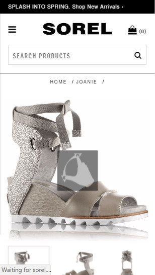
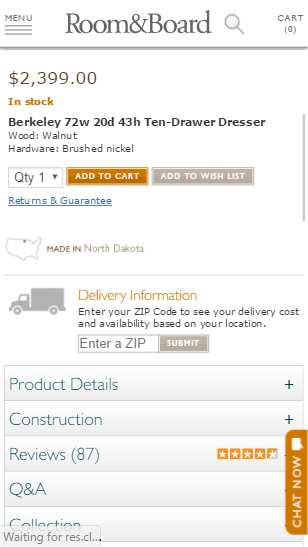
The next important element on a PDP is the product details. On desktop it’s easy to fit everything in with the large, high res screens everyone has today, but on mobile this can be a challenge. The best treatments we’ve seen of this, and on 14 of the top sites we reviewed, is to collapse all these details in an “accordion” style menu. Users can easily and quickly identify what info is there, then expand the info that they are looking for. It keeps things clean and allows the user to focus on exactly what they need.
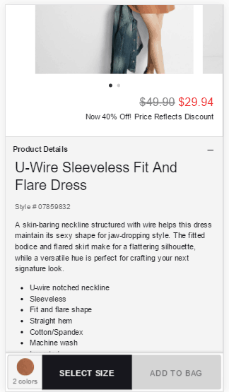
Finally, the goal of this page is to get users to add items to their cart. When a user has decided to add an item, we want as few barriers as possible in their way. This means no scrolling through the whole page looking for the button, or not realizing there are configuration details they’ve missed resulting in errors. The emerging trend here – only 4 of our best in class sites have adopted this so far – is that many sites are pinning the Add to Cart button, along with configuration details like size and color, to the bottom of the page. This keeps those details in front of the user at all times and makes sure they don’t have to go looking for it once they’ve made a decision.
As with all the items we’ve highlighted throughout this Best in Class research, be sure to consider how each of these items works for your brand, and test anything that isn’t obvious. In the coming weeks look out for tips on building your cart and checkout experience to minimize cart abandonments and maximize your revenues. Want to make sure you don’t miss the next installment? Sign up for the Inflow newsletter with the form below. Happy optimizing!


0 Comments