There aren’t many variables to the shopping cart and checkout process, and conversion optimization is all about making those few steps as frictionless as possible.
Each year we complete an in-depth analysis of the features and technology of twenty best-in-class sites, including their shopping cart and checkout process. In this article, we’ll compare the checkout experience of one of those market leaders, GoPro, with one of our former clients, Bras N Things.
We’ll point out best practices we’ve repeatedly tested and found to increase conversions. We’ll also highlight areas of friction that can lead to poor user experience issues and cart abandonment.
The Add-to-Cart Experience
Best Practice: If the majority of orders on your site are one item, send users straight to the cart.
If customers tend to buy only one item per order, take them straight to the shopping cart after adding an item. This encourages users to start the checkout process.
Since GoPro likely has small order sizes, this is what we expected. Instead, the site takes you to a modal—not the cart, checkout, or product page. From there, your two options are to view the cart or start the checkout process. There’s no clear way to continue shopping from the modal, either.
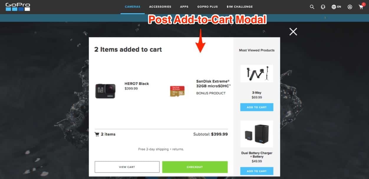
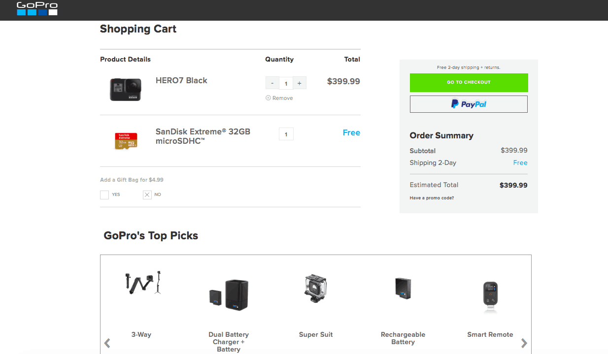
GoPro’s shopping cart page includes the same information as the modal, including a cross-sell area. Since the two pages are so similar, GoPro should just eliminate the modal.
Best Practice: If you tend to sell MORE than one item per order, keep users on the product page.
When you add an item to the shopping cart on Bras N Things’ site, a pop-up shows you the added item but keeps you on the product page. The pop-up encourages users to keep shopping by promoting free shipping with larger purchases.
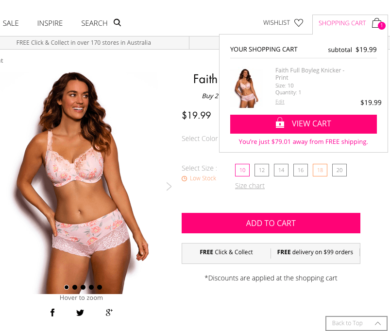
By keeping a user on the product page, it prompts them to browse the related items or popular products shown below.
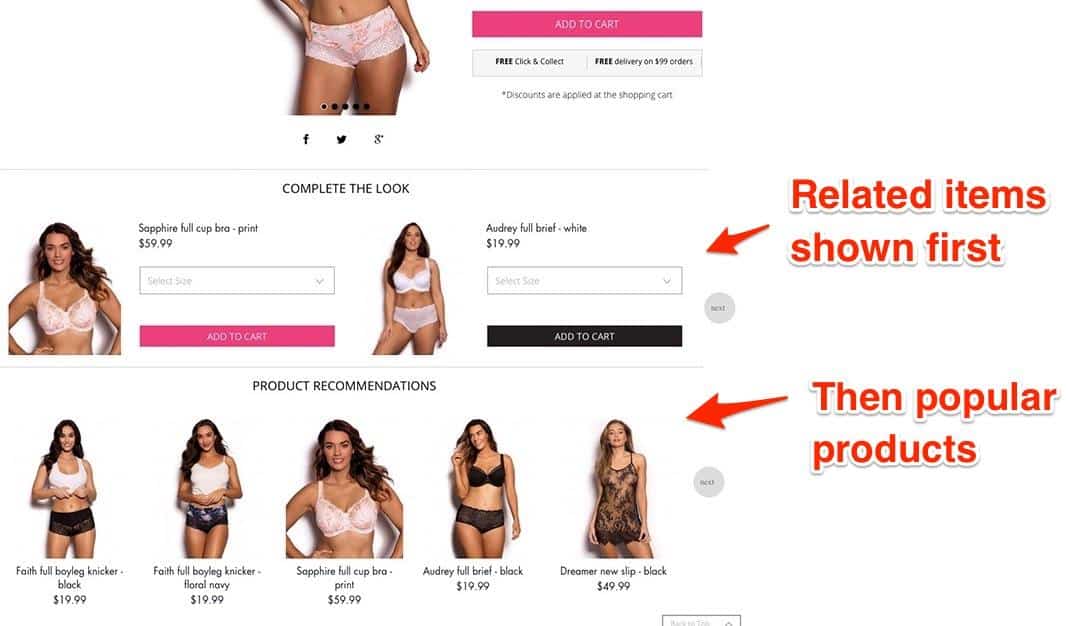
In summary, don’t encourage users to go to the shopping cart until they’re ready to check out.
Note: We’ve worked with dozens of eCommerce companies to find the add-to-cart and checkout experience that optimizes conversions. We can do the same for you. Contact us here.
The Shopping Cart Experience
Best Practice: Hide the coupon code field.
More eCommerce sites are taking coupon code validation out of the checkout process and relegating it to the shopping cart. This can aid conversions by removing a distraction in the checkout process. In addition, we’ve found it helpful to hide the redemption box behind a button or a link. Both GoPro and Bras N Things do this.
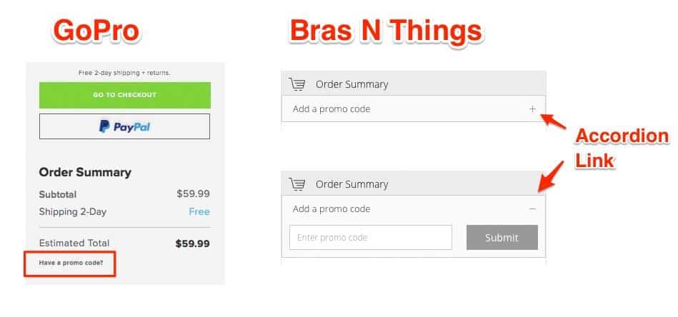
When brands leave their coupon code field exposed in the checkout process, customers are much more likely to leave the site to find a code to use. This gives them the opportunity to rethink their purchase.
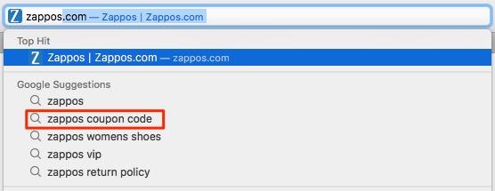
Often, if the coupon code field is left exposed, one of the top Google suggested search terms for that brand is coupon code, which indicates that lots of people are searching for coupon codes. You don’t see that as much when sites have the field hidden behind a click.
Best Practice: In the shopping cart, switch from cross-sells to upsells.
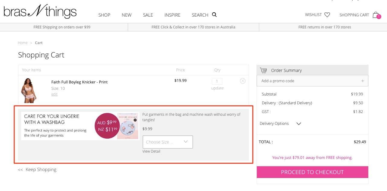
Once a user clicks on the shopping cart, they’re likely done making larger purchases; they’re less likely to add “more of the same” to their purchase. Promoting items that go along with the items in the cart, such as accessories, are more likely to work well.
When I add a pair of knickers to the shopping cart at Bras N Things, my upsell is a wash bag. The site assumes that I’ve finished selecting lingerie, but I’m going to have to wash the item I’m purchasing.
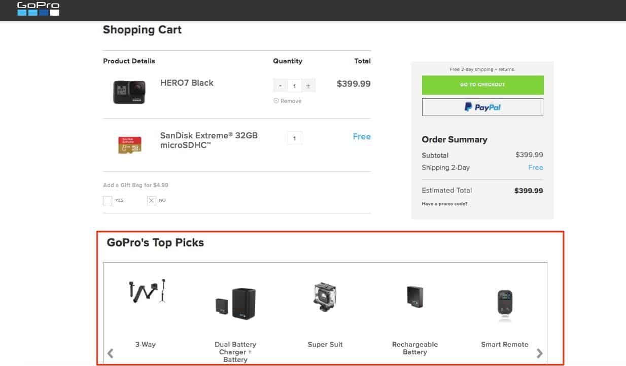
GoPro also shows related products and accessories in the shopping cart. However, there’s one difference that stands out: the header. By calling this section “GoPro’s Top Picks,” it’s unclear whether these are best-selling products or accessories that will definitely work with the camera I’ve selected.
Checkout Best Practices
Best Practice: Default everyone to guest checkout.
Unless someone has already logged into the site before starting the checkout process, we’ve found it best to assume that everyone is checking out as a guest, meaning don’t add an extra step to ask someone to log in (as you see with GoPro).
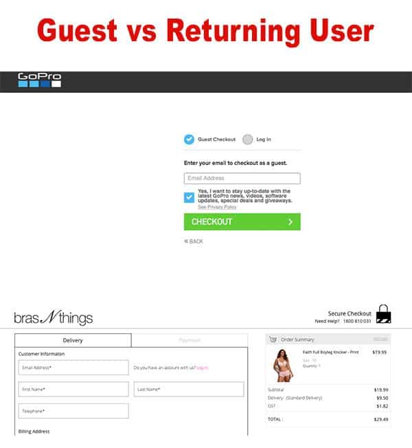
While GoPro seems to include this added step to encourage people to sign up for their email list, they could alternatively add an opt-in checkbox during the checkout process and get rid of this screen.
The key here is to keep the ability to log-in on the screen without disrupting the checkout process. When a returning user gets to the shipping or payment section, and there’s no information filled out, they’ll realize they haven’t signed in yet.
Best Practice: Remove distractions from checkout pages.
We’ve found that removing promotions or navigation elements that aren’t applicable always tests really well. Once shoppers are in the check-out process, give them only the options that you want them to do — options related to completing the purchase.
Both GoPro and Bras N Things remove the navigation header and all other unnecessary sections.
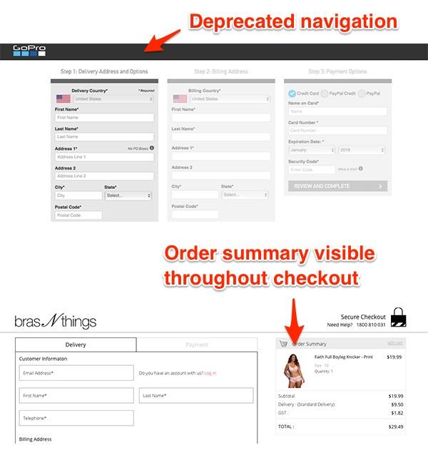
Best Practice: Display order summary throughout checkout.
Users want to be sure they are buying the right items, and having an order summary visible throughout the checkout process can prevent users from getting sidetracked. It also serves as a positive reminder of the items they’re purchasing. While GoPro does not have an order summary on their checkout page, Bras N Things keeps it visible throughout.
Trust Your Customers Over Industry Trends
One thing we’ve found over years of studying best-in-class sites and working with our own clients: test, test, test.
Even market leaders don’t make all the right choices, and every site is different. Conversion rate optimization depends on testing your site to see what your unique customers are expecting and responding to.
While features consistently perform well, there are many aspects of the user experience that can vary from site to site. It can depend on your market, brand awareness, among other factors.
Note: If you’re looking to fine-tune your checkout process to raise conversions and revenue, we’re ready to help.
—
Editor’s Note: In February of 2018, HanesBrands acquired Bras N Things and is in the process of making changes to the brand’s website. Their checkout process has changed since the writing of this piece.



0 Comments