Pagination
Pagination (going to page 2, 3, and beyond) is slowly going by the wayside, and being replaced with Lazy Load (where Gallery page results appear as you scroll down). While just four of our 20 Best in Class eCommerce sites do this in 2017, last year at this time we saw just one do it, so the trend is growing.
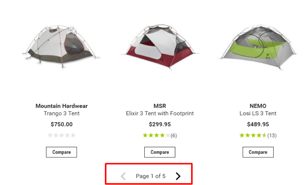
Above is a Gallery page from REI.com, who we predict next year will be using Lazy Load. The technology and requirement for good usability is slowing things down since the Lazy Load functionality is not “out of the box” like Pagination yet. When it is developed (at a high cost), a lot of consideration needs to be given to real user scenarios like, “What if they scroll down, click to a product page, and then use the Back button?”. Lazy Loading gallery pages with a continuous product grid also has technical SEO implications, which can be addressed on most platforms with a some customization.
In the end, we think Lazy Load will be more widely adopted. Any kinks will be worked out to the point where Shopify and Magento implementations of it are easy and smooth. Until then, Analytics will be reminding us that page 2 is the number one path to purchase from page 1, and the vast majority of people never take it. So why not just show it to them?
Compare on Product Pages
When people are on Gallery pages, they may want to compare products (and that is great to do). However, if they click into a product page, they likely aren’t benefiting from a compare feature since it now becomes a lot of work to navigate to and find another product to compare.
Only one of our top 20 Best in Class websites do this, and it is absolutely perfect for them.
*Tip: If you do offer users the ability to compare products on Gallery pages, make sure it is obvious (super obvious) how to compare the products once they have been selected, and whatever you do, keep them on the page (i.e., Lightbox) instead of sending them into a silo compare page. Take a look at our Best in Class comparative matrix to see who compares products well.
Zoom Over Replaced by Click to Zoom
We having been slowly witnessing the Zoom Over feature trending downward, while Click to Zoom has been on the rise. It has gotten to the point where it is now the most common practice to only show the larger image after it has been clicked. It makes sense, since showing an image without explicit user permission is bound to be a bad experience.
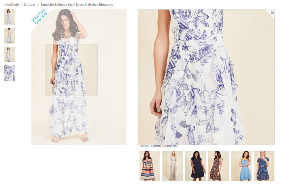
On our Best in Class eCommerce list, only six of the 20 sites still do Zoom Over (i.e., ModCloth), while the rest do Click to Zoom. If you are going to do Zoom Over, at least do it well. Make sure you don’t block important content, have confusing elements on the page (i.e., the close “x” on the larger image that you can never reach to click).
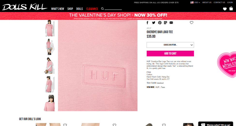
A good example of Zoom Over is on www.DollsKill.com.
360 Degree Out, Video In
If you are www.UnderArmour.com and have awesome, custom, high-end, well-done 360 degree images that add to the user experience more than plain product shot images ever could, good for you!
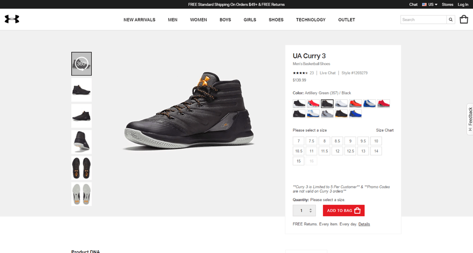
But if you’re like most eCommerce sites, which have low-quality 360 degree images, you should save your time. Not many sites do 360 anymore, and the reason is (we know from testing) that the shops that have the resources for 360 typically have the resources for video, which tends to outperform 360.
Sure, there are exceptions, but not many.
Unfamiliar Trust Seals
We are the testing partners for the McAfee seal, the Norton Shopping Guarantee (Symantec), and have also partnered in the past with Stella Services and AllClear ID. In all that “badge testing” (more than 300 tests by our estimations), we can tell you — perhaps better than anyone — that some badges just don’t test well.
Sure, some badges are yours to use and others will tell you wonderful things, but unless the seal has Norton, McAfee, Stella, or BBB, I would test it. The ones I mention work, so save your time testing them if you have more important experiments to run.
Recently Viewed Items
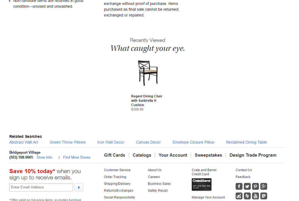
Michael Kuehn here at Inflow calls Recently Viewed Items “the poor man’s wish list.” This feature is intended to help users remember stuff they may have liked earlier during their visit. While it sounds promising, the fact is that there are better ways to help people recall what they like (i.e., a “like” button that does not force you to register).
Sure, CrateandBarrel.com does it (and they are an awesome site on our Best in Class list), but 18 out of our 20 best in class sites don’t do it. Besides, Crate and Barrel does it at the bottom of their product pages, which is a “save” feature for them, not a real UX benefit. I know they tested it there, and you should, too.
Coming Soon & Even New
Before you add any “Coming Soon” language to your site, ask the the simple question, “Who cares?” If the answer is obvious, then go for it, but it you are like most eCommerce sites, then your site visitors don’t care about products they can’t get yet.
This also applies to “New” products for many sites. Unless your site is geared to hobbyists, enthusiasts, or others who return to your site often to pursue their passion or interest, then they likely won’t care what is new or not. Again, ask, “Who cares?”
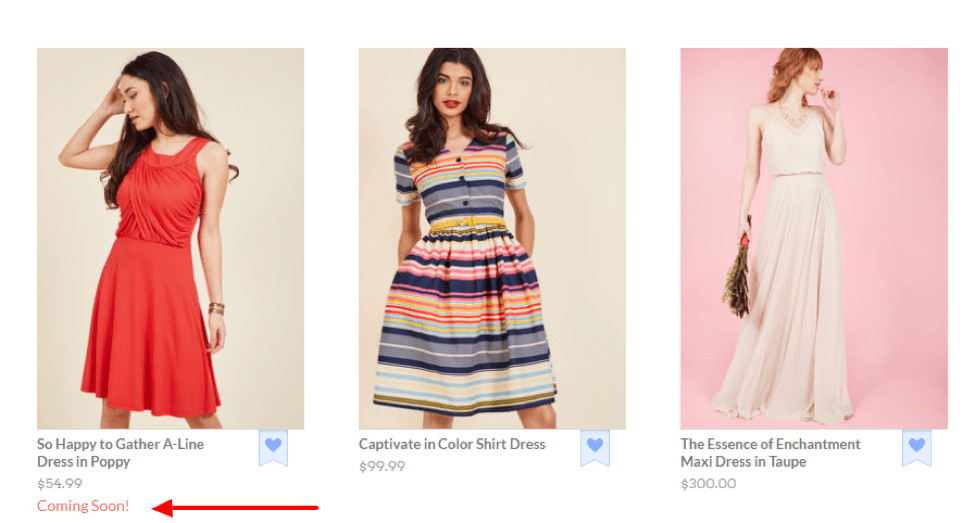
Above, ModCloth (the only site using “Coming Soon” on our Best in Class eCommerce list) is a good example of a site that does well to use Coming Soon.
Below, www.Nixon.com shows how it handles a “New” denotation on its Gallery pages.
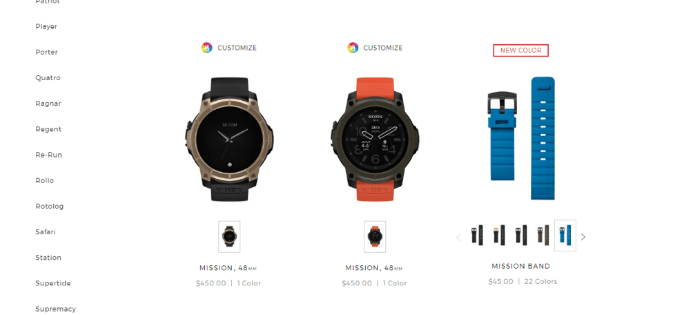
Nixon, whose returning customers are all watch enthusiasts, wants its audience to know what is new to ensure they have an easy time reviewing the latest fashion the brand has to offer.
It’s pretty simple. If you have a popular “What’s New” area of the site, then you should keep it and denote “new” on the site. If you don’t see your new section lit up in Analytics with a high conversion rate, give it a second thought.
Parting Thoughts
We spend hundreds of hours each year keeping our Best in Class eCommerce Matrix up to date. This matrix makes it clear which features are trending upward, and which ones should be questioned. eCommerce is hard work, and implementing almost any feature requires time and attention to ensure you don’t break the first rule of Conversion Optimization: Don’t make things worse.
Happy testing!


0 Comments