The Strongest Global Elements From Our Best in Class eCommerce Websites
As part of our continuing work compiling data on the Best in Class eCommerce sites on the web, we’ll be breaking down some of the common features for each section of an eCommerce site. Starting at the top, this post focuses on global site elements that help your users get oriented and navigate the site.

#1 Site Speed
This is one of the most important factors in determining whether people will shop on your site. It’s difficult to know exactly how this impacts your bounce rate because in many cases, users will actually bounce back to Google before your analytics have had a chance to log a page view. Research from Google shows 40 percent of users won’t even wait longer than three seconds for a travel or retail site to load.
Based on the above, you’d expect some of the best sites on the web to load like lightning, but not so. Of the 20 desktop and 20 mobile sites we highlight, not a single one scored faster than 85 on the Google PageSpeed Insights tool. While this is somewhat telling, there are other factors at play here. For one thing, many of these sites have very strong name recognition, which results in users having a bit more patience with a slow site.
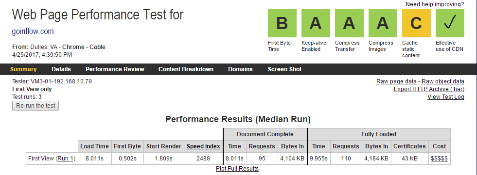
The other factor is that overall speed is not necessarily the goal, but rather the appearance that things are getting done. Without going totally over the top trying to improve site speed, you can make minor changes that result in the first bit of the site loading quickly, then load the rest in the background while the user is looking at the top of the page. A tool we like to use here, which gives a lot more information than the Google tool, is WebPageTest. Here you can see a video of your site loading, along with a comparison of what it would look like with a few minor tweaks. The ideal situation is to get the time to Start Render down below two seconds –– notice how GoInflow.com scores an A on most categories with a Start Render under two seconds, but the whole site takes over eight seconds to load the first time.
Ultimately this is more of a situation where your own experience will be the best indicator. If you wouldn’t wait for a site to load on a 3G connection, your users won’t either. Be sure to test at least one page from every template on the site –– Homepage, Gallery, PDP, Cart –– to get a good idea of where you stand.
#2 Orientation and Trust
First and foremost, users getting oriented to a new site are going to respond to the aesthetic; if your site looks unprofessional, it will fail to gain the trust of the user, resulting in a quick bounce. With all of the great eCommerce platforms around today, there is really no excuse to have an ugly site, so make sure yours is up to snuff.
Assuming you pass the aesthetics test, there are a few questions users ask subconsciously when they land on a new site: Who are you? What do you do? What does it mean for me? Your site needs to answer these questions in the first few seconds, or a user is not going to continue on. The challenge here is that not all users are going to land on your homepage, so these questions need to be clearly answered on every page of your site, or more specifically, in your header.
All but one of our Best in Class sites do a really good job answering these questions. Only ModCloth is a bit unclear about their main value proposition, so they rely on name recognition. A great way to do this quickly is with a tagline near your logo. Eye tracking studies commonly show that users first look to the upper left where most sites have a logo, then track to the center of the page. By putting the tagline by the logo, you ensure it will get read immediately. See Webroot for a good example of how the tagline can help set the tone.

Trust, as mentioned earlier, is another important element in getting users oriented to the site. If you don’t have a recognizable brand, make sure you have some kind of trust element visible when the user lands. The tagline again can handle this, for instance: “25 years curating the best widgets around.” Additionally, awards from industry groups or badges like Norton, McAfee, Google Trusted Stores, or the BBB all build trust with the user. You don’t have to hit them over the head, but don’t make them search for it buried in the footer, either –– a simple floating badge in the bottom corner is sufficient to put that worry to rest. Finally, letting users know there are real people behind the business does wonders. We’ve seen in testing that doing something as simple as adding a phone number to the header increases purchases without significantly increasing call volume –– users just felt better knowing someone was actually there! Similarly, chat on desktop and tap-to-call on mobile drive conversions without causing a large spike in engagement with customer service. BONUS: use a picture of a person your target user would want to speak with for your chat and call modules.
#3 Navigation
Surprisingly, the majority of sites we included as Best in Class did not pin the navigation on Desktop. That being said, we see this win in testing all the time and is worth trying out on your own site if you’re not doing this already. Just make sure your treatment doesn’t take up too much screen real estate. On mobile, the results were split, with exactly half our sites using sticky navigation. This is more important on mobile given how much further users have to scroll back up to get to the top of the page.
One nice trick we’ve seen on a few sites is to hide the navigation when a user is scrolling down, then expose the header as soon as they start scrolling back up –– regardless of where on the page they are. Check out the Adidas website on your mobile device for a good example of this.
The other factor we’ve seen move the needle, which has been widely adopted by our sites on both desktop and mobile, is the ability to drill down to sub-categories right in navigation. Most sites do this with a “mega menu” style navigation on desktop, and we’ve also highlighted this as an emerging trend on mobile.
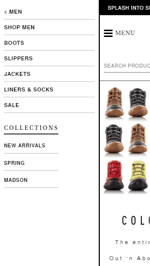
More common on mobile right now is the Hamburger navigation –– 18 of our 20 sites on mobile use this. Testing recently has shown that some users might not understand what the three bars mean, so it is best to give a text cue with this as well. See Sorel.com for an example of both this and the sub-category navigation.
Finally, be sure to include an icon for your shopping cart, along with an indication of the number of items. This is important even if there are zero items –– you might think a user would know if they’ve added something already, but with all the cross-device traffic today, we actually see in analytics about five percent of “new” users go straight to the cart –– an indication they expect something to be there already, most likely from a session on a different device. All but two of our relevant Best in Class sites are doing this.
#4 Promotions
The majority of the Best in Class sites include a separate category for sale and clearance items. If this is applicable to your business, we highly recommend this, as it is frequently one of the more popular paths for return users who already know your catalog. By contrast, only one of the top desktop sites was doing in-navigation promotion (i.e., within the mega menu under standard categories).
When it comes to highlighting any current promotions within the header of the site, there was not a clear consensus. On desktop we did see the majority of sites doing this, but on mobile it was not as common. We attribute this to the fact that there is more room to work with on the desktop, but don’t let that deter you –– just make sure you design the the space you have. Check out how Sephora is pitching their subscription box on mobile using a small banner at the top of every page to see how this can work without hurting your overall user experience.

Entry and Exit Offers used to be a common tactic, but recently we’re seeing a trend away from these elements on the better sites. For entry, if you want to continue capturing emails, there are two factors to consider.
- Don’t take over the whole screen; try a push down or push up instead. These are less intrusive and can be done on multiple pages within a session rather than going for it all on the first page view. Most users don’t know the second they arrive on a new site if they even like it, let alone whether they want to give away personal information. Win their trust first and you’re more likely to get that email.
- Make sure you offer something in return. On content sites, this is often something like an eBook or some other useful download. For eCommerce, this normally takes the form of offering a discount or some kind of exclusive access. Regardless of what it is, make sure the value is in line with how much you value collecting that email.
Very few of our best sites are doing exit offers anymore, largely because it can be seen as cheapening your brand. Many savvy shoppers are conditioned now to leave items in their cart for a day or two just to see what kinds of offers they get. If you’re doing an exit offer, we recommend strongly considering how this offer plays with your brand identity –– if you position as a higher end product line or service, don’t offer large discounts! One of the best tactics we’ve seen on exit is to just highlight again the primary value proposition –– this can convince a user without having to give up any of your margin or cheapen what your site offers.
As with all the items we’ve highlighted throughout this Best in Class research, be sure to consider how each of these items works for your brand, and test everything that isn’t obvious.
In the coming weeks, look out for more optimizations by page type, starting with the Homepage next and working our way deeper into the site.






0 Comments