
When it comes to your eCommerce business, your homepage can make or break your conversion rate.
Finding the right attributes to include and the perfect web design for your audience can take a lot of trial and error. Too much of the latter, and you’ll lose out on a huge amount of revenue and potential customers.
We want to end that guessing game. That’s why, for several years, we’ve compared the conversion rate optimization features and tactics used by dozens of the top eCommerce sites, testing the most promising out on our clients’ websites.
In this post, we’ll break down exactly what we’ve learned in our 2024 conversion optimization best practices research, including:
- Why your eCommerce homepage is so important
- Which nine eCommerce homepages best practices we recommend (with examples)
- And why you should always test what’s right for you
Your eCommerce Homepage = Your Online Storefront
For many users, your eCommerce homepage is their first impression of your site, your products, and your brand. It needs to be stellar, engaging, and easy to navigate to keep them coming back for more online shopping.
Lots of eCommerce stores focus on optimizing and promoting individual category and product pages. But we argue you should spend just as much (and even more) time designing and optimizing your homepage.
It doesn’t have to be a complete redesign, either. A few simple changes can make all the difference to your conversion rate. (Trust us: We’ve done the tests.)
9 eCommerce Homepage Best Practices to Improve Conversions
Below, we share nine of the legacy features and emerging eCommerce homepage best practices identified in our 2024 Best in Class Report.
These are design elements we recommend testing for your online store that could make a significant difference in your customer experience and conversion rate in the months and years to come.
- Display categories outside of the menu.
- Swap out your hero-image auto-slide carousel.
- Display individual products on a device-wide standard.
- Use a global promotion area.
- Implement a live chat function.
- Use a hamburger menu on mobile.
- Expose your search icon or field.
- Make contact info easily available.
- Improve your site speed.
For a full list of our recommended conversion rate best practices, you can also download our complete research report now.

1. Display categories outside of the menu, especially on mobile.

Most eCommerce sites already display their product categories in mobile menus and/or header areas.
But, as our research reveals, you need to take it a step further: Show selected categories on your mobile homepage, too.
Let’s look at a few eCommerce homepage examples:
Both Wayfair and Target expose their shopping categories on their main mobile homepage. Shoppers don’t have to use the hamburger menu to get to where they want to be.
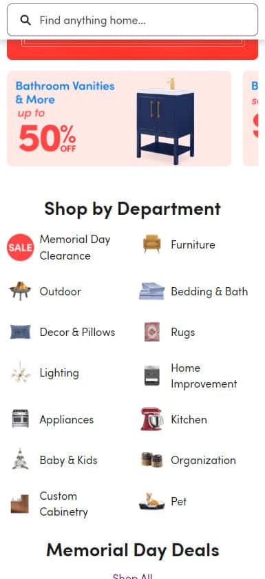
You have limited real estate on a mobile homepage. By making your categories and subcategories easy to access outside of your menus, you can prevent frustration in your shoppers and improve your user experience.
For what it’s worth, we’ve found category navigation from a homepage to test incredibly well on both desktop and mobile.
Something else we’ve discovered: Many of the best eCommerce homepages in 2023 have made these category or product elements swipeable on a mobile device, as well.
2. Swap your hero image auto-slide (“carousel”) for a hybrid approach.
A hero image slider will automatically slide through images on your homepage. It may seem like a great way to display attractive product images, but its effectiveness on mobile and desktop varies greatly.
In our research, we’ve found that many eCommerce homepages no longer show these carousels on desktop or mobile devices. Our extensive A/B testing demonstrates why: The auto-slider only wins against other approaches (like a single static image) about 50% of the time.
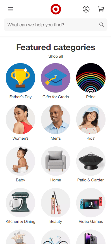
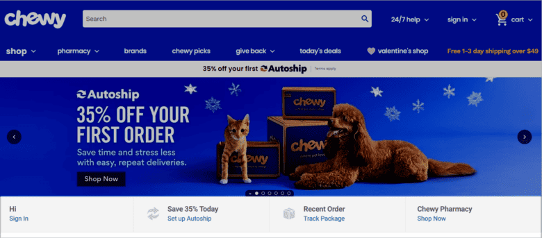
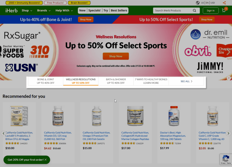
However, we’re also keeping an eye on a new approach — the hybrid slider, made popular by Amazon’s homepage design. This design incorporates both an active slider and static tile images of important categories and products.
This look is replicated on both Chewy.com and iHerb.com, where the brands display a slider along with static elements highlighting their account offerings and promotions, respectively.
Bottom line: A slideshow’s efficacy depends entirely on the quality and effectiveness of the slides. If you can communicate your value proposition in one image and/or a few static tile images combined with a slider, that might be the best way to go.
Of course, always test to make sure!
3. Display individual products on a device-wide standard.
It seems like a no-brainer, but showing examples of your popular products can be a huge eCommerce homepage design best practice.
You’ll want to look at your different display options — mobile and desktop — when deciding whether to implement this standard. If you choose to display individual products, make sure to deploy the feature across all of your eCommerce site homepages.
We also highly recommend incorporating personalization efforts into this product display, to serve only the most relevant offerings to your website visitors.
On Mobile Homepages
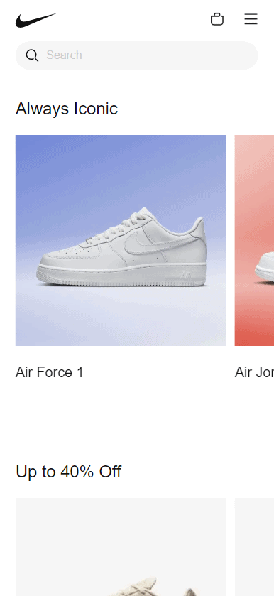
We typically recommend clients test showing individual products before implementing it on their mobile homepages. Product widgets like “best sellers” and “new products” are popular places to start.
As an example, here are Nike.com’s product features on mobile:
On Desktop Homepages
Whatever you choose to do on your mobile homepage, we recommend implementing it on your desktop homepage, as well. With Google’s mobile-first indexing and the necessity of mobile/desktop parity, having different content on your desktop and mobile sites is a very bad idea.
Here’s what Nike’s product-level links look like from their desktop homepage:

4. Use a global promotion area.
A global element appears on all web pages of the site and is usually a header, footer, or floater element. While the popularity of this feature has decreased among our studied sites over the last year, based on our in-house research, we still believe it’s a great place to promote your latest sales or offerings.
Backcountry uses a global promotional area (and a pop-up entry offer) to grab their shoppers’ attention and alert them to the latest deals and sales.

Other popular global elements among eCommerce sites in 2023 include:
- Sticky menus/headers that travel with shoppers while they scroll
- Footer newsletter signup forms
- Sale/clearance areas
- Alternate product collections
Here at Inflow, we’ve extensively tested these elements and found them to increase conversions 90% of the time. If you’re not using global header elements, you’re missing a huge opportunity.
Learn more about other popular eCommerce global elements by downloading our complete research report now.
5. Implement a live chat function, if it proves its worth.

A live chat is definitely one of our recommended eCommerce homepage best practices for 2023. In our testing, adding a live chat feature has never lost out to the control group — but it can end up in tied performance fairly often.
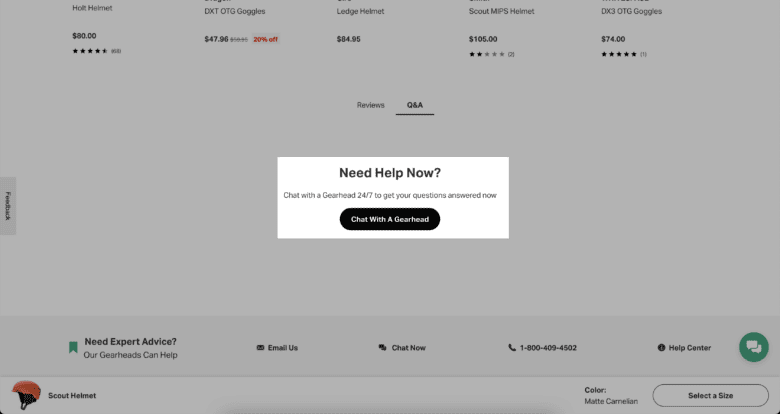
Remember: Manning a (high-quality) live chat costs money. Unless you have customer service agents available to you, the ROI of adding an agent just for a live chat is not proven.
Instead, we recommend you A/B test a live chat function first. Measure any lift in conversions against the cost of hiring an agent or service to man it.
You can also consider a hybrid approach of an AI chat feature that directs any shoppers who need a higher level of service to your live customer support team.
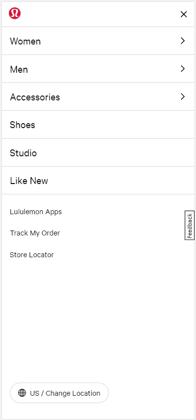
6. Use a hamburger menu on mobile.
It seems minor, but the drop-down hamburger icon is one of only a few icons that have near-universal recognition. (Another one? The shopping cart icon.) Using this icon just makes sense; it improves conversion by speeding mobile users through the buying process.
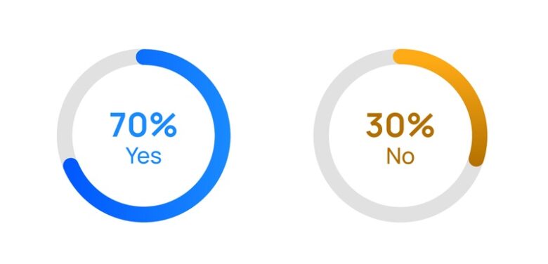
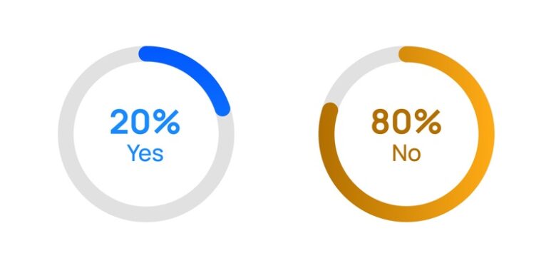
Using random icons on your eCommerce homepage, on the other hand, is guaranteed to slow down a user. Why should a user be forced to learn your unique icons just to make a purchase? Sure, you could add a label, but our tests have only produced positive results 30% of the time.
Instead, take the approach of our Best in Class sites: Ditch the icons and be clear with concise, detailed labels in your navigation bar.
7. Expose your search icon or field outside of your menu.


Users who search your site should convert at least 2.5x as well as users who don’t. (If they don’t, something is wrong with your search function.)
Because of this, make your search bar as prominent as possible (within reason). Don’t bury it in your navigation menu.
Below, you can see how Backcountry exposes the search function completely on mobile. North Face, on the other hand, chooses to expose only its search icon, which can be expanded for usability.


If you haven’t in a while, check your desktop search stats. If your searcher revenue is significant, go ahead and expose the search function on your mobile site, too.
Did you know this search data can also be valuable for your SEO team? Read our recommended strategies for internal search queries here.
8. Make contact info easily available.
The vast majority of our Best in Class sites make their contact information clear and visible to their customers — and for good reason.
Adding your customer service phone number is an easy way to build trust among your shoppers. While most of your customers may choose to use your live chat option, there are still plenty of people out there who prefer to pick up a phone, especially when it comes to complex order issues or questions.
This information can be included at the top of the page or in your footer, as long as it’s highly visible for those who need it.
9. Improve your site speed.
Shockingly, the majority of our studied Best in Class sites failed to achieve a score of 50 or greater on Google’s PageSpeed Insights test — but that doesn’t mean site speed isn’t an integral eCommerce homepage best practice.
Remember, there is only one absolute rule in conversion optimization: The faster your site, the better it will convert.
A mobile site’s page load time is typically slower than a desktop site for a variety of reasons (primarily, bandwidth and hardware), so it’s crucial that you optimize your eCommerce site and homepage for mobile display.
Google keeps moving the goalposts on what is considered “good” page speed. We usually look for a score above 60, an FCP above two seconds, and a cumulative layout shift in the green.
You may have achieved a good score in the past, but this algorithm is updated about every year or so — making it harder to score above 60. Because improving site speed (especially on mobile) is hard, my recommendation is to stop every single other CRO effort on your site and focus exclusively on site speed to try and achieve a score above 60.
Our Final Suggestion: Test Everything
You probably saw this coming.
In our research, these eCommerce homepage best practices have generally proved useful, but every site is different. We recommend you test each one before rolling them out across your site.
After all, what works for some of these sites — even those deemed “Best in Class” among eCommerce brands — may not be best for your business and shoppers.
Follow the scientific method: Test one conversion optimization at a time, and be patient to get accurate, usable results that will eventually reveal the best homepage design for your eCommerce site.
If you want a testing partner, our team is happy to help. We’ll implement these CRO eCommerce homepage best practices on your site, identify what works, and lift your conversion rate to its full potential.
(Request a free marketing strategy proposal anytime to learn more.)
Until then, kickstart your CRO strategy by downloading our complete Best in Class Report below. In it, you’ll find more than 150 data points from 10 top eCommerce websites, with recommendations for your product page and category page design, checkout processes, and more.
Download Our eCommerce Best in Class 2024 Report Now.
You can also read more about eCommerce CRO in our other guides:


0 Comments