While not quite as crucial as their product page counterparts, eCommerce category pages still serve an important role in converting your target audience to purchase — as long as they’re optimized properly.
Today, we’ll walk you through some of our recommended eCommerce category page best practices, based on the findings in our 2024 Best in Class Report and our own A/B testing with dozens of eCommerce brands.
We’ll share some of the must-haves and emerging trends that top retailers are using on their gallery pages — so you can implement them across your own eCommerce site and reap the benefits, too.
As a reminder, you can download our complete research report anytime for free.
Keep reading to discover the top mobile and desktop design trends your store needs to be using in 2023.
Table of Contents
5 Legacy eCommerce Category Page Features
In our annual research, we’ve found a few gallery page features to have outlasted others when it comes to use on top eCommerce sites and potential impact on shopper conversion rates.
These include:
1. Multi-Select Facets

If you don’t already allow users to select multiple facets when searching for relevant products on gallery pages, this remains a must-have in 2024.
We’ve found a strong return on investment (ROI) for our own clients who have invested in this kind of faceted navigation.

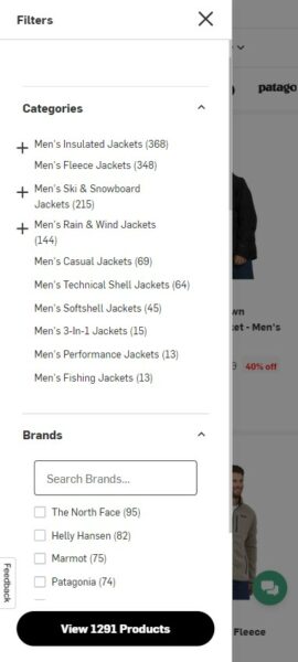
On mobile sites, we’ve also seen a great improvement in the user experience around this feature. For instance, many sites allow you to select multiple facets before refreshing the product category page.
For example, Backcountry shows you the filters you’ve already selected, as well as how many specific products this leaves in your search results.
2. Show Available Product Colors
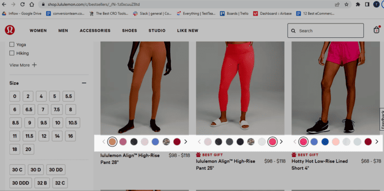
This feature has grown more common over the last few years. We daresay it’s becoming a convention as eCommerce technology has advanced.
In our own testing, we’ve found that showing what colors are available for a given product definitely aids conversions. (Even better: Interactive product images that change when users mouse over each color swatch.)
This feature is equally popular across mobile sites. While interfaces of the past fared poorly against the “fat finger rule,” years of testing (and the growing number of mobile eCommerce sales) have optimized this functionality on smaller screens, too.

3. Price Selection Within Facets

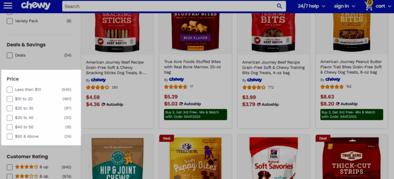
Filtering products via a price range is a useful feature that customers appreciate; however, highlighting it can lower your average order value (AOV).
The key on most sites is to place this filter option lower than other popular filters you want potential customers to consider first — such as color, brand, etc.
4. Show Ratings and Number of Reviews
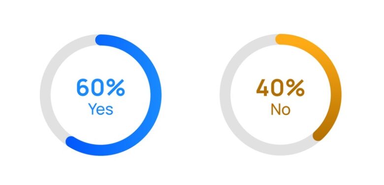
Showing star ratings and reviews on category pages remains a best practice in 2024. Although not all of our studied sites are using this, we highly recommend it for all eCommerce stores, especially those emerging companies with little brand or product awareness.
We’ve talked at length about how important individual product reviews are to online conversion rates. The more you can show off (positive and high-quality!) reviews on as many web pages as possible, the more likely your shoppers will be to make that final purchase decision.
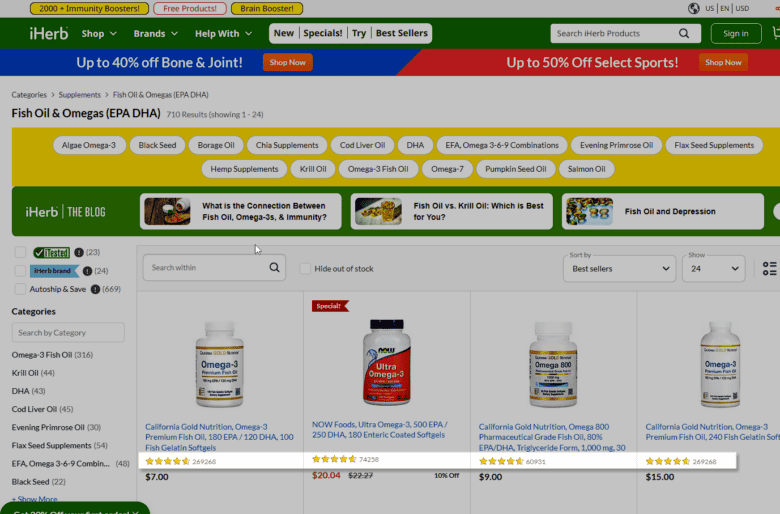
Note: If your products only have a small number of reviews, you could test removing this feature on specific category pages if you’re worried about the effect of those few reviews on your products’ credibility.
Otherwise, we recommend incorporating these into your gallery pages.
5. Saved Filters
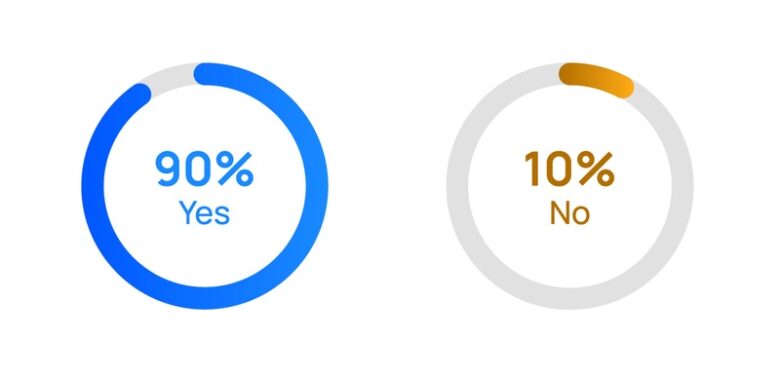
Saving selected filters when customers go back and forth between product detail pages and category pages is incredibly useful — and incredibly helpful to conversion rates. It’s great for usability, and we’d go so far as to call it a best practice for the modern eCommerce business.
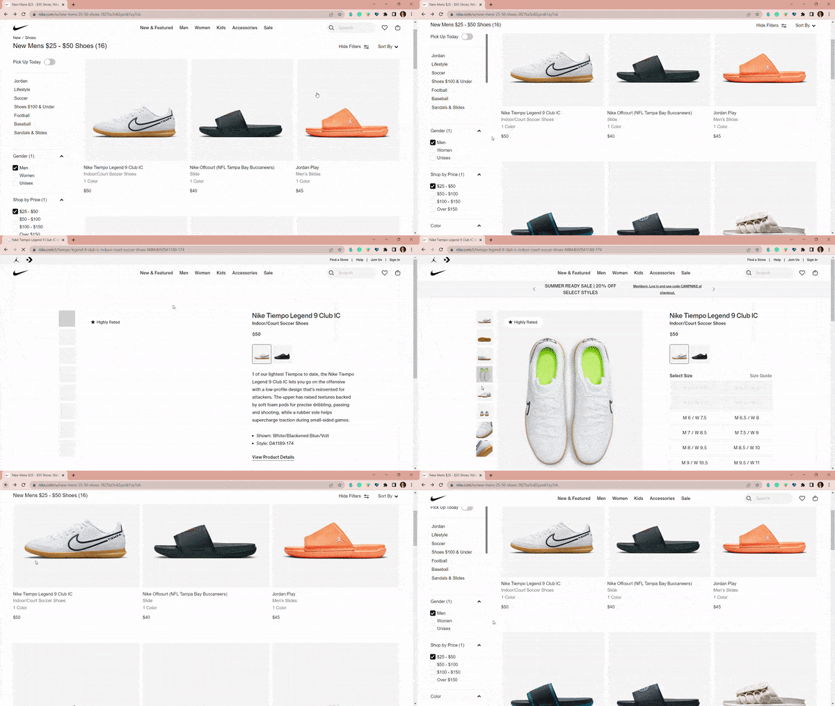
We especially recommend using saved filters for mobile users, to eliminate user frustration for those shopping on smaller screens.
5 Emerging Trends for eCommerce Gallery Pages
The eCommerce industry has certainly gone through some shakeups over the last few years, and shopper behavior has changed, as well.
Our selected Best in Class sites clearly are keeping up with that shifting behavior, as indicated by the following emerging trends in eCommerce category page design.
Note: These aren’t in use on all of the websites we studied, but they are being adopted by more and more companies when compared to our previous research. As always, we recommend testing extensively before applying any of these features across your eCommerce website.
If you want help implementing your testing plan, reach out to our CRO experts to get started.
6. Show Savings Amount
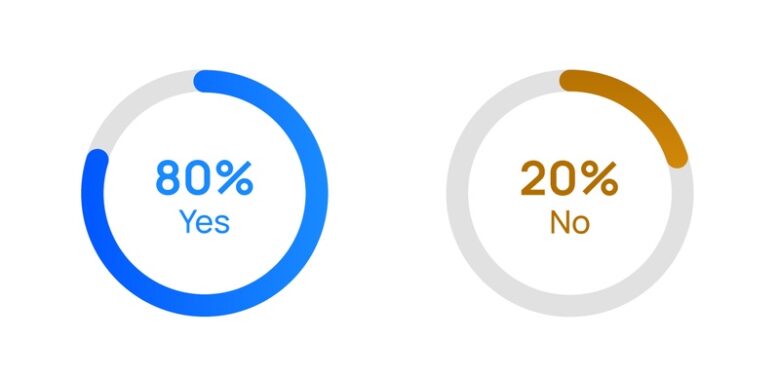
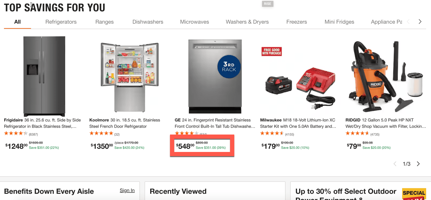
Shoppers love a good bargain, and our studied eCommerce sites are responding. We’re seeing more sites include the specific savings amount (in percentage and/or dollars and cents) for sale items on the category page. This makes it incredibly obvious what kind of deal the shopper is getting — and can push window shoppers to convert for fear of missing out.
While only half of our studied sites deployed this feature last year, this feature is now found on 80% of our 2024 Best in Class websites.
7. Return to Vertical Position

In addition to saving filters when customers go back and forth between product and category pages, today’s best eCommerce sites are also saving the vertical position of the user on the category page itself.
This prevents user frustration in having to find their previous browsing position from the top of the page, especially on longer category pages with lots of product listings, as demonstrated in the example from Target below.

Right now, this feature is commonly found on top online retailer sites — but it’s not as common in general among all online stores. We’d recommend implementing it to give your site a competitive advantage in 2024.
8. Subcategory Visual Elements

Customers love to quickly find what they’re looking for. Visual subcategory elements located under the main category name can point them to their desired product and reduce frustration.
Typically, these are thumbnail or button-type elements that shoppers can click to further filter or hop to another subcategory page altogether.

For the first time in our Best in Class history, the majority of studied eCommerce sites are using this feature. We’re confident in saying that it will soon be a category page best practice for conversion optimization.
9. Product Flags

Product flags can quickly communicate product features — such as “new,” “popular,” and “on sale” — to customers browsing your category pages. The increase in use from 2023 to 2024 indicates this feature is working well for larger eCommerce sites.
However, these can be tricky for smaller sites to implement, and we recommend thorough testing before launching them across your online store.
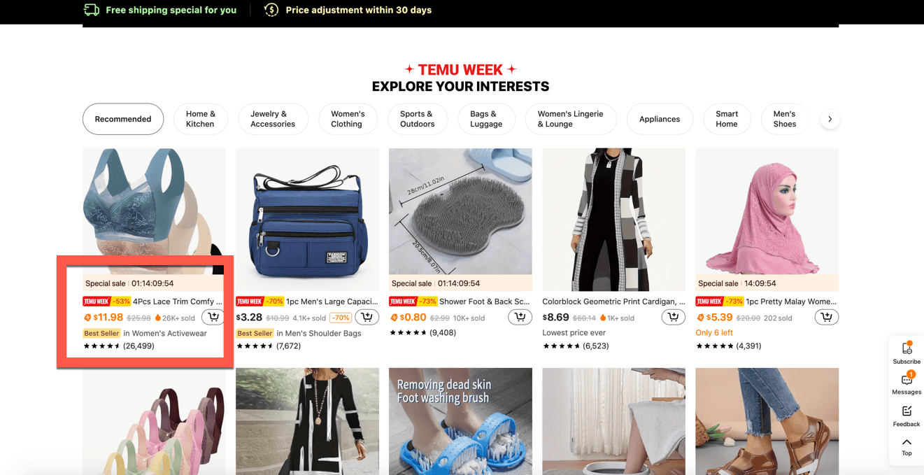
Take care not to overdo it, either. If every product has a flag, the impact on conversion will diminish. After all, not every product should be labeled a “best seller”; otherwise, you risk harming your brand’s authenticity with shoppers.
10. Global Promotional Area

Finally, we’re seeing more top eCommerce sites use global promotional areas on their category pages in 2024.
Once reserved for navigation bars, these promotional areas allow for category-specific (or sitewide) sales messaging. This can be useful if your category pages are the first touchpoint for your shoppers, who may miss promotions displayed on your homepage.
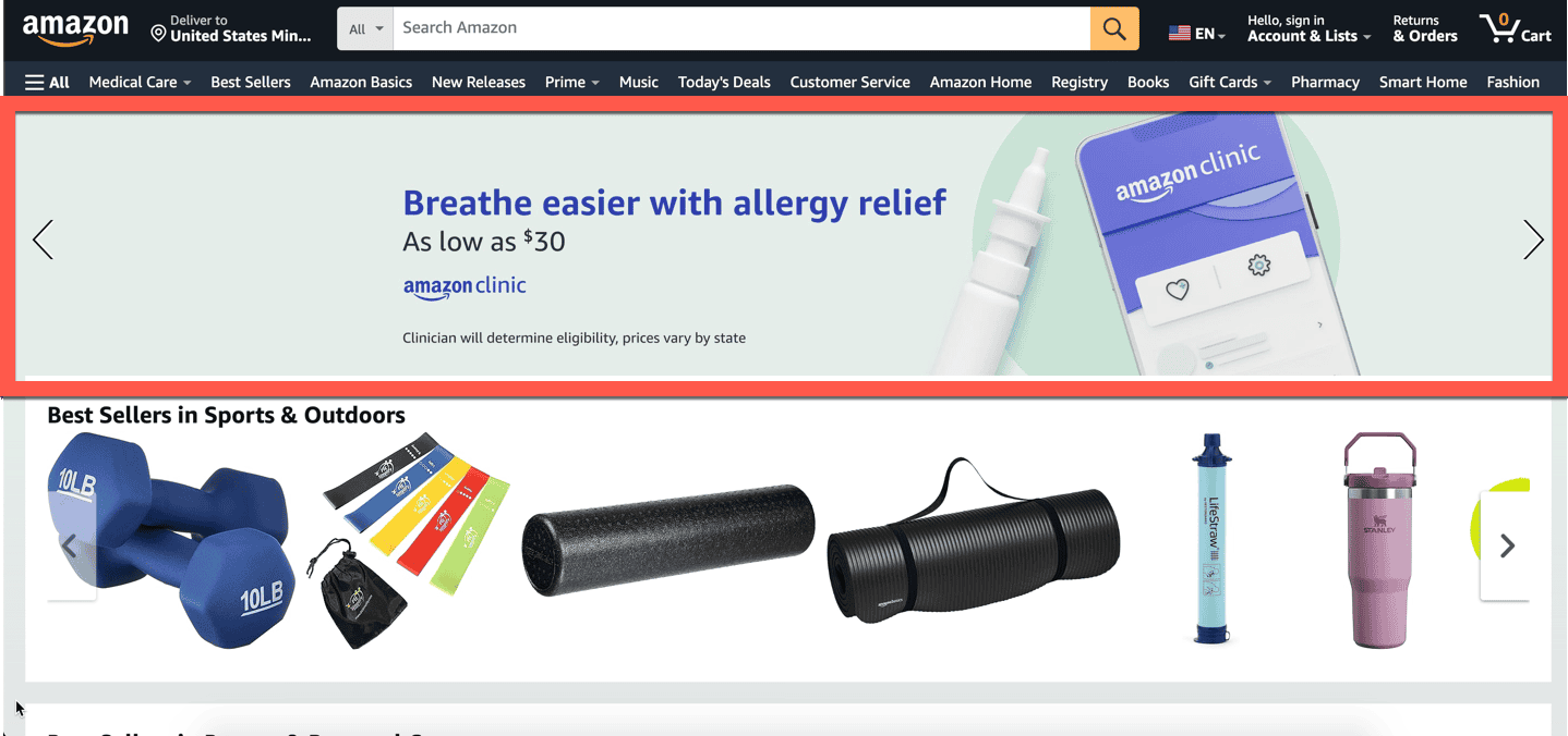
While only a third of our studied sites were using this feature last year, a majority are employing it in 2024. We’d recommend adding it to your list of A/B tests for website conversion.
Build Your Category Page Strategy With Our Complete Best in Class Report
Looking at the features top sites are implementing is a great way to gather ideas for your own site — especially if you see them happening in your market.
However, nothing beats testing new features for yourself.
Prioritize your testing ideas — and build the best CRO strategy for your eCommerce site — by downloading our complete Best in Class Report today. In it, you’ll find more than 150 data points from 10 top eCommerce sites, including more eCommerce category landing page best practices, as well as recommendations for your product pages, checkout flows, homepage, and more.
Download Our eCommerce Best in Class 2024 Report Now.
Need help creating that testing strategy?
Our CRO team is happy to discuss how your website compares to those in our Best in Class Report, as well as recommend optimizations to improve your customer experience and increase your online conversion rate.
Reach out today to get started.
In the meantime, learn more about category page best practices in our following digital marketing guides:


This comprehensive guide outlines essential eCommerce category page practices for optimizing conversions in 2024. Valuable insights for online retailers seeking to enhance their user experience and drive sales.